 Website designed and developed by Amy Shah and Amin Halimah
Icon from Feather icons
TreeHuggers: Gamifying Environmental Education
Created as part of a classroom design challenge, TreeHuggers aims to spread awareness about environmental issues in an attention-grabbing way. Our team used used various methods of research and iterative design, facing certain challenges involving time and finding a group of representative users.
PROJECT SCOPE
OCT-DEC 2019
Team
Tessa L. - Content Strategist
Connie X. - Art Director
Linh V. - Research Coordinator
Amy S. - Project Manager
Tools & Skills
Google Surveys - User Research, Testing, Surveying
Figma - Prototyping, Wireframing, UI Design
Adobe Photoshop/Illustrator - Art & UI Design
Market Research, Competitive Analysis
THE PROBLEM
It's more important than ever to be informed about our actions and the environment, so that
we can protect ourselves from the damaging effects we have caused.
My team and I wanted to create an app that can make learning about environmental issues fun,
to cater to a wider audience. We also want the app to incentivize learning by showing
real-world environmental progress. So we asked:
How might we educate the public about environmental issues in an interesting way?
OUR PROCESS
- Defining the UserOur PersonaFeature PlanningUser Surveying
- Round 1 Design & ResultsRound 2 Design & ResultsRound 3 Design & Results
- Key Learnings/Takeaways
MARKET & DESIGN RESEARCH
DEFINING THE USER
The youth are becoming increasingly concerned about and interested in environmental issues, especially climate change. Youths are also fairly interested in social media and competitive social gaming platforms, like Animal Crossing or gaming through Discord. Our persona embodies the traits and values of climate-conscious youth.
MARKET & DESIGN RESEARCH
OUR PERSONA

MARKET & DESIGN RESEARCH
FEATURE PLANNING
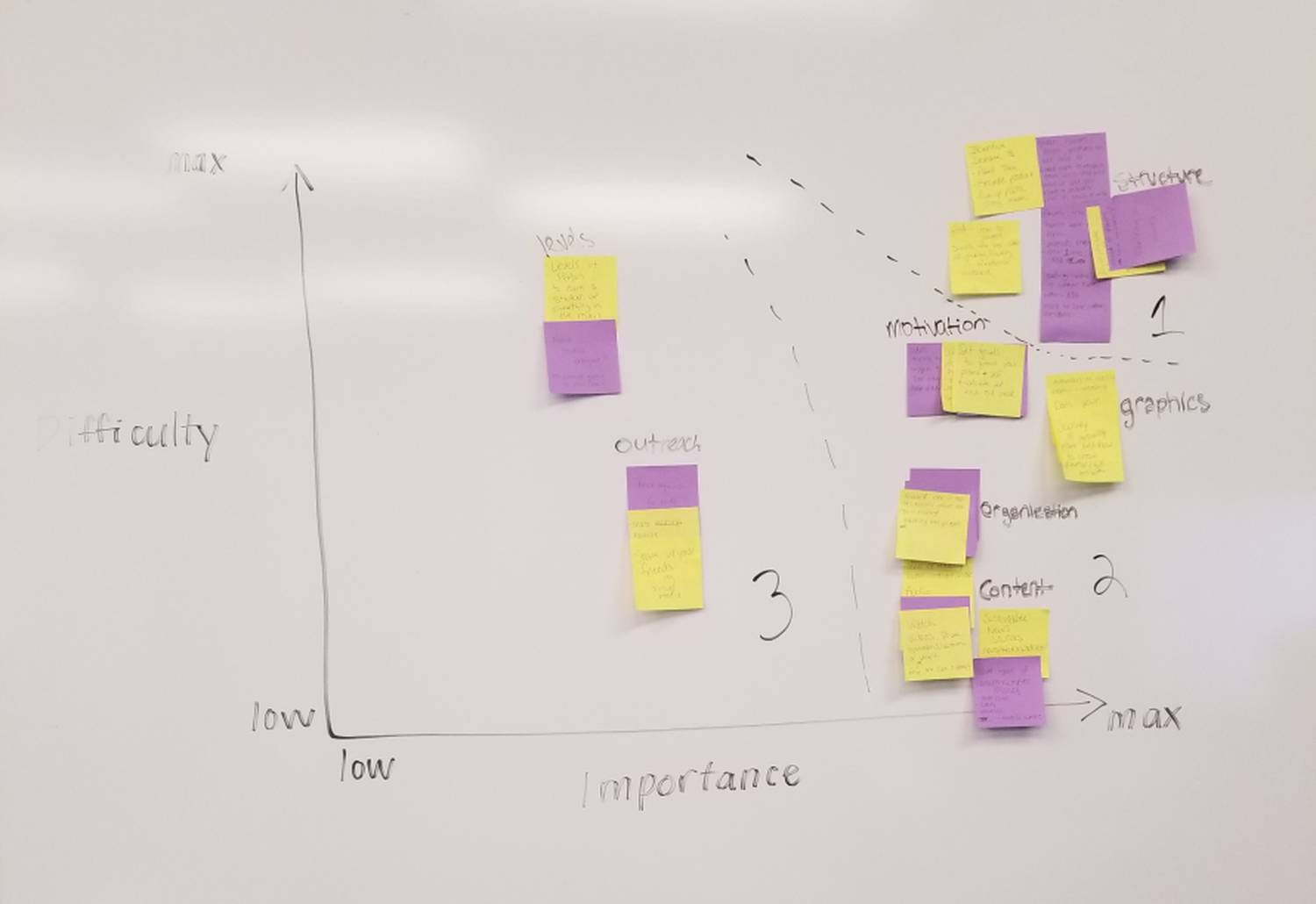
We used an importance vs. difficulty matrix to plan out what features we should implement first, based on our time limit. We decided on the type of game (and incentives), app design/structure, graphic content & imagery, and the types of environmental issues we'd include.
MARKET & DESIGN RESEARCH
USER SURVEYING
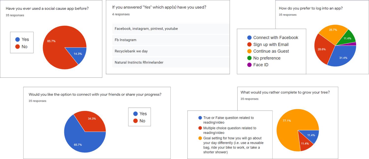
We released a survey asking potential users of various ages for their preferences
on certain features, game types, graphics, and other content. We received 35 responses for
questions shown below.
Participants would like a social aspect to the app, and would prefer to answer goal-oriented
or call-to-action questions to get them engaged.
PROTOTYPING & TESTING
ROUNDS 1-3
DESIGNS & RESULTS
We tested for 3 rounds with low-, mid-, and high-fidelity prototypes of our app. Our participants were fellow classmates (who did not all fit our persona) - 5 new testers each round. Our results shown below, prototypes on the next slide.
PROTOTYPING & TESTING
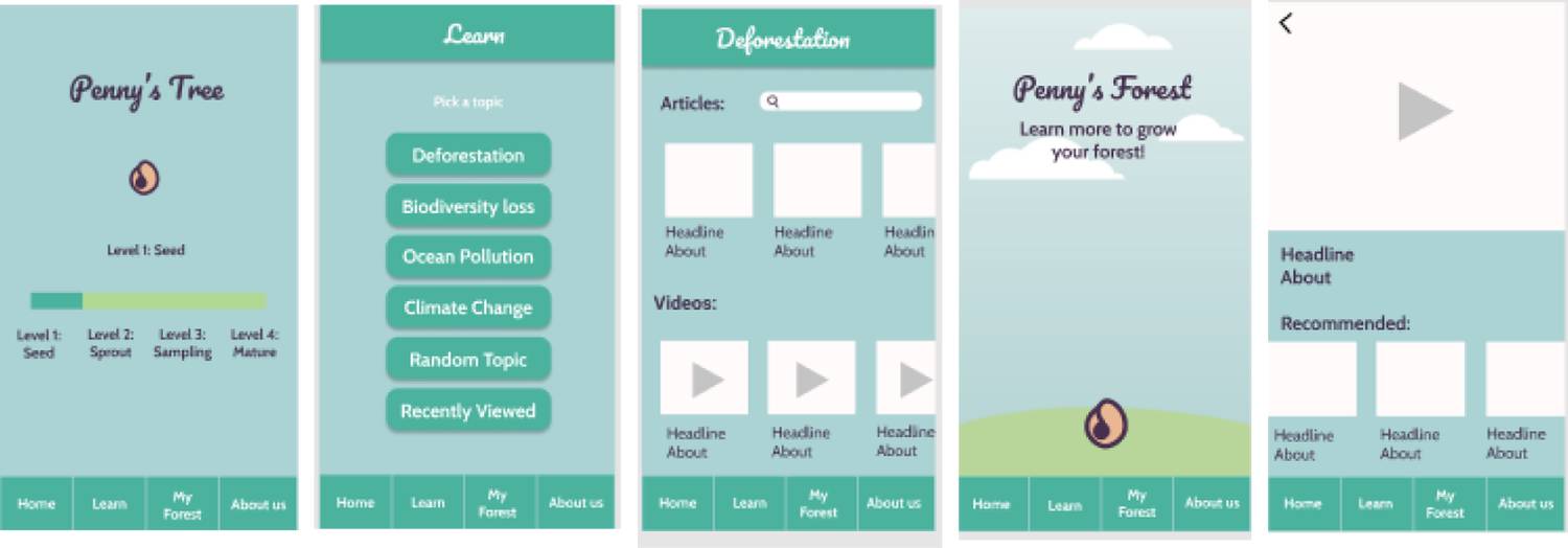
ROUND 1 - DESIGN
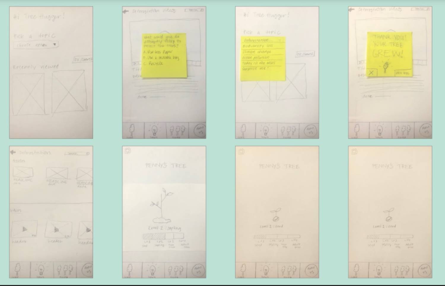
Low Fidelity
App features:
- home page to choose an environmental topic or see recently viewed articles/videos (picture 1)
- article/video page that displays article content or video (picture 5)
- questions that pop up once user is finished with article/video (yellow note in pictures 2 & 4)
- “My Tree” page displaying tree growth and progress bar (tree grows with every question a user answers)
ROUND 1 - RESULTS
- Particpants were able to quickly
and easily navigate the simple layout and straightforward process
- They appreciated the progress bar for leveling up
- Many were not sure what the “My Forest” page was, and would have liked more context
PROTOTYPING & TESTING
ROUND 2
Mid Fidelity
Updates:
- colorful interface
- updated progress bar
- easier navigation
- graphic forest
- list of topics (with choice of “random”)
- simple, familiar layout
ROUND 2 - RESULTS
- The quizzes allowed testers to set real-world personal goals
- They found the app easy to navigate
- Many preferred more graphics/imagery that could enhance the “fun” side of the app
- Most believed the “About Us” page is not necessary in the main navigation bar
PROTOTYPING & TESTING
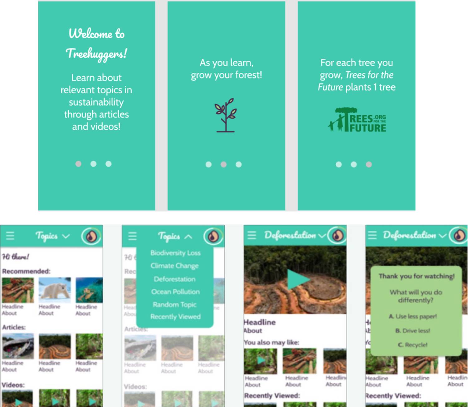
ROUND 3
High Fidelity
Updates:
- brighter colors
- added onboarding
- cleaner layout
- compact side & drop-down menus
ROUND 3 - RESULTS
- The color scheme & graphics appealed to testers by making the learning aspect more playful
- The updated layout and side menu allowed users to quickly navigate through main content
- There was confusion around the wording of some menu/button items
- Users would enjoy seeing a “share” option on the “My Forest” page or in a personalized profile
FINAL DESIGN
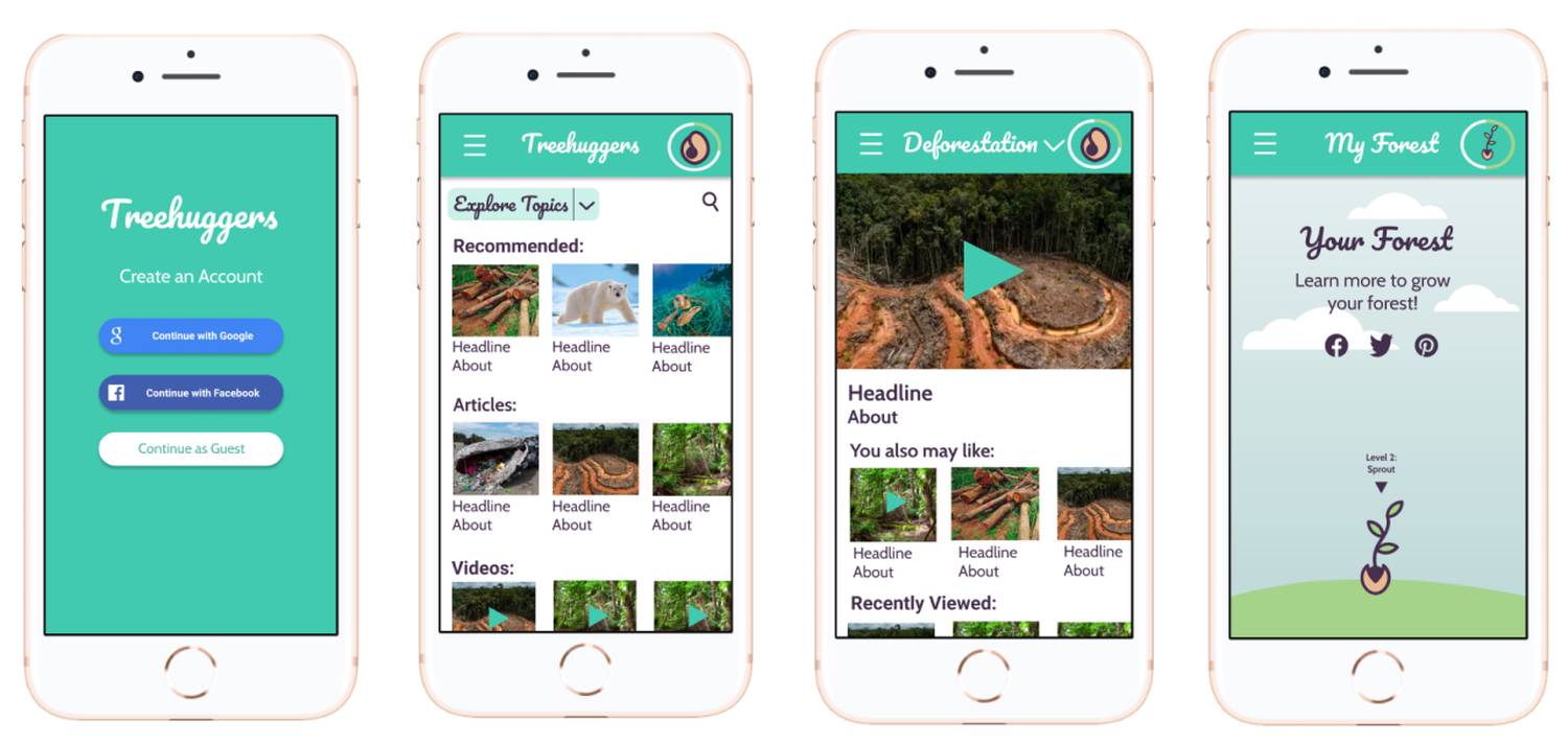
Our final deliverable sees clearer wording, a smoother layout, and ability to connect with friends through social media sharing. Time constraints did not allow us to implement a full user profile. The final product is a high-fidelity prototype, linked here
FINAL THOUGHTS
We learned a few things:
- If a user cannot take any action on a screen, besides to go to another screen, said screen
is likely not very useful
- The main/home page should help guide the user to accomplish their goals for our app
(help them do what they came to do)
- Test early, test often. Having a person's thoughts and goals in mind, even in the
ideation phase, can help drastically improve and speed up the development process
While this project helped us learn more about the UX design process and how we can utilize different
research and design techniques to our advantage, I believe we have yet to accomplish our goal of
providing a fun way for users to learn - considering our app incentivizes the learning, but does not
make the learning itself any more "fun" than if users were to just read an article.
REDESIGN:
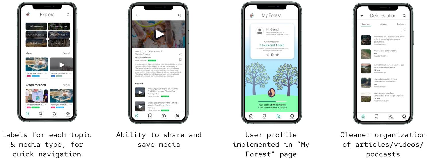
TREEHUGGERS II
Two years later, I revisited TreeHuggers and looked into how I could improve its features and functionality to be a more efficient incentivized method of learning. I revamped the interface, and added some features that we didn't get to previously (user profiles, organized groupings). Additional features were implemented based on research and their performance and use in popular websites and app (labels, video features). Prototype linked here
