 Website designed and developed by Amy Shah and Amin Halimah
Icon from Feather icons
Mobile News App Redesign
Cox Media Group (CMG) owns a vast suite of websites and apps that provide breaking news and live coverage for each of
their news stations' areas. Specifically, as a UX designer, I helped design experiences for 15 TV stations and 50 radio
stations around the US. The products we design are branded for each station (colors, logos), while being consistent with
the broader CMG brand's design system.
CMG's products for each station include websites, mobile apps, newsletters, and CTV apps. During my time, I primarily
focused on mobile apps, websites, and newsletters. My goal for our products was to improve upon them by enhancing their
UI, experience/function, and the way they tell our stories. Storytelling through products, etc. is incredibly
underestimated and under-used. Beyond the interface itself, storytelling can create a wonderful experience for users.
This case study will focus on the redesign of mobile apps for CMG's TV stations. It will also only show designs for one
of the stations, WSB (Atlanta) - though designs are the same for all stations, except for color. Not all designs were
launched on the app before I left CMG, some are concepts that were waiting to be placed on our roadmap, which, due to
lack of development resources, was limited.
PROJECT SCOPE
My Role
Wireframing & Prototyping
Market Research
Ideation
User Research
Tools & Skills
Figma - Wireframing & Prototyping
Lyssna - Usability Testing
SiteImprove, Lighthouse - Accessibility
Jira - Organization
Tableau - Data Research
THE ASK
The product team always looks for improvements to the various apps, websites, and newsletters that we own.
When I first joined, I was told to express any concerns I see with our products, and was tasked with the challenge of
analyzing our mobile apps, utilizing research to understand usability best practices with news apps & mobile-first
design, and ideating features that improve user experience and increase user loyalty to the apps.
OUR PROCESS
- Users & GoalsMobile Apps Initial StateBrand & Style Guide
- Featured Breaking NewsArticle ListsVideo ContentNavigation
- Tests & Results
ANALYZE
USERS & GOALS
Along with location, CMG's audience profile is as follows:
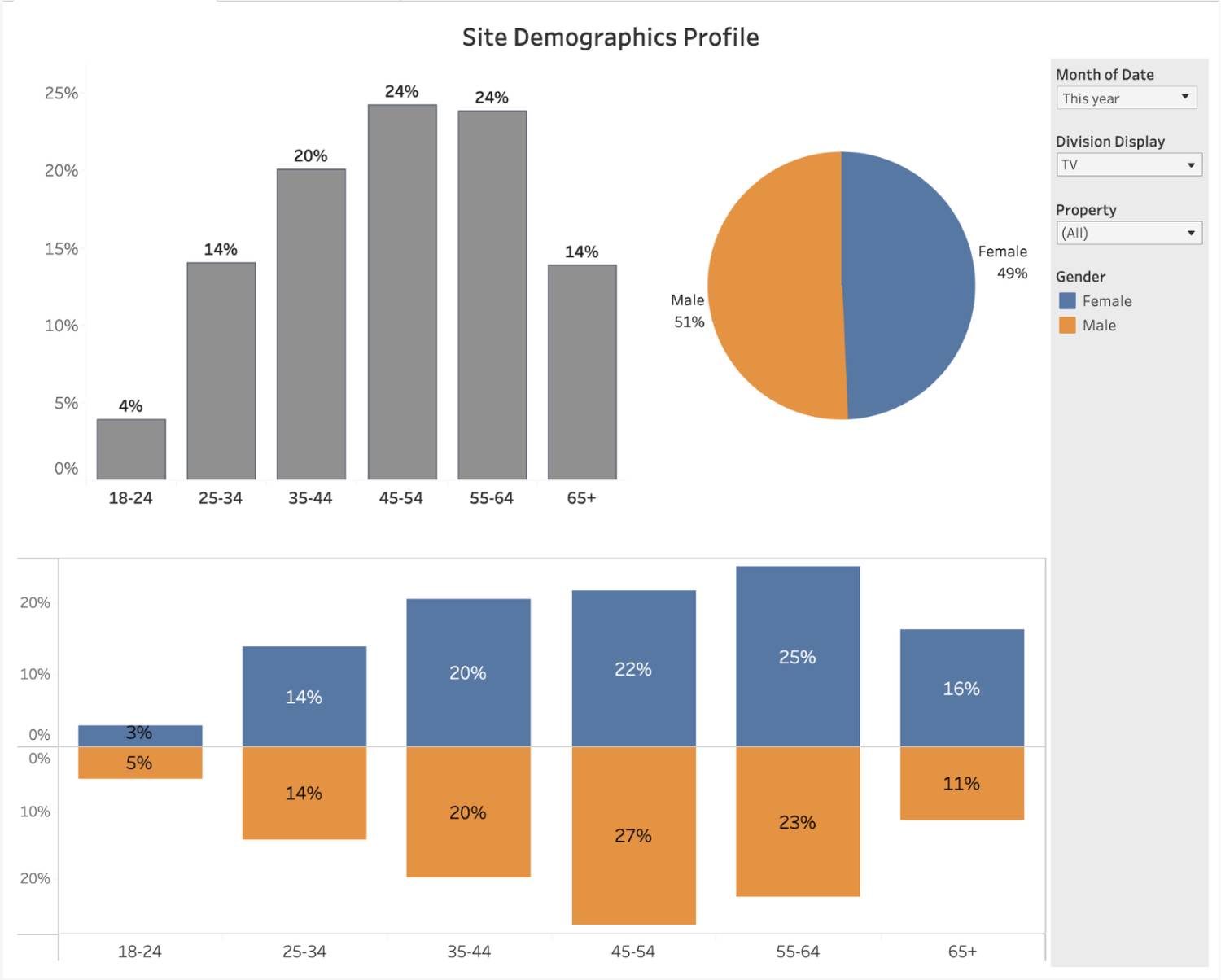
- 51% male vs 49% female audience
- Most users skew older, between 35 and 64
- Read, watch, and learn about current events on a local and national scale
- Easily access various news stories, clips, and live streams
- Stay up to date and fully informed on current events
ANALYZE
MOBILE APPS INITIAL STATE
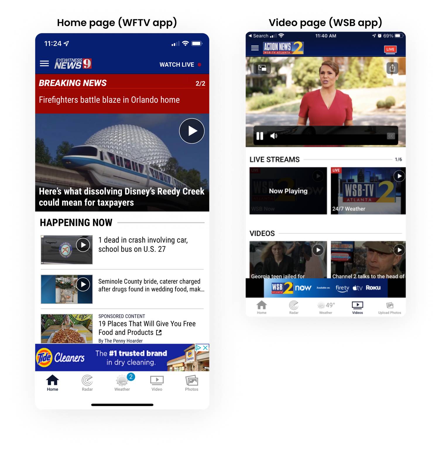
State of the apps when I was tasked with the redesign challenge (limited images available) are below.
- Large imagery and banners pushing content down
- Intrusive ads
- UI enhancements needed
- Video style needs improvement (CMG aims to be video-first)
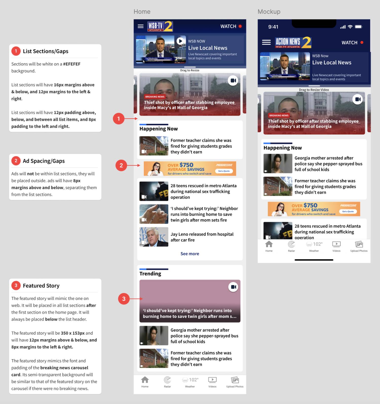
- Lists of articles go on indefinitely on home page
ANALYZE
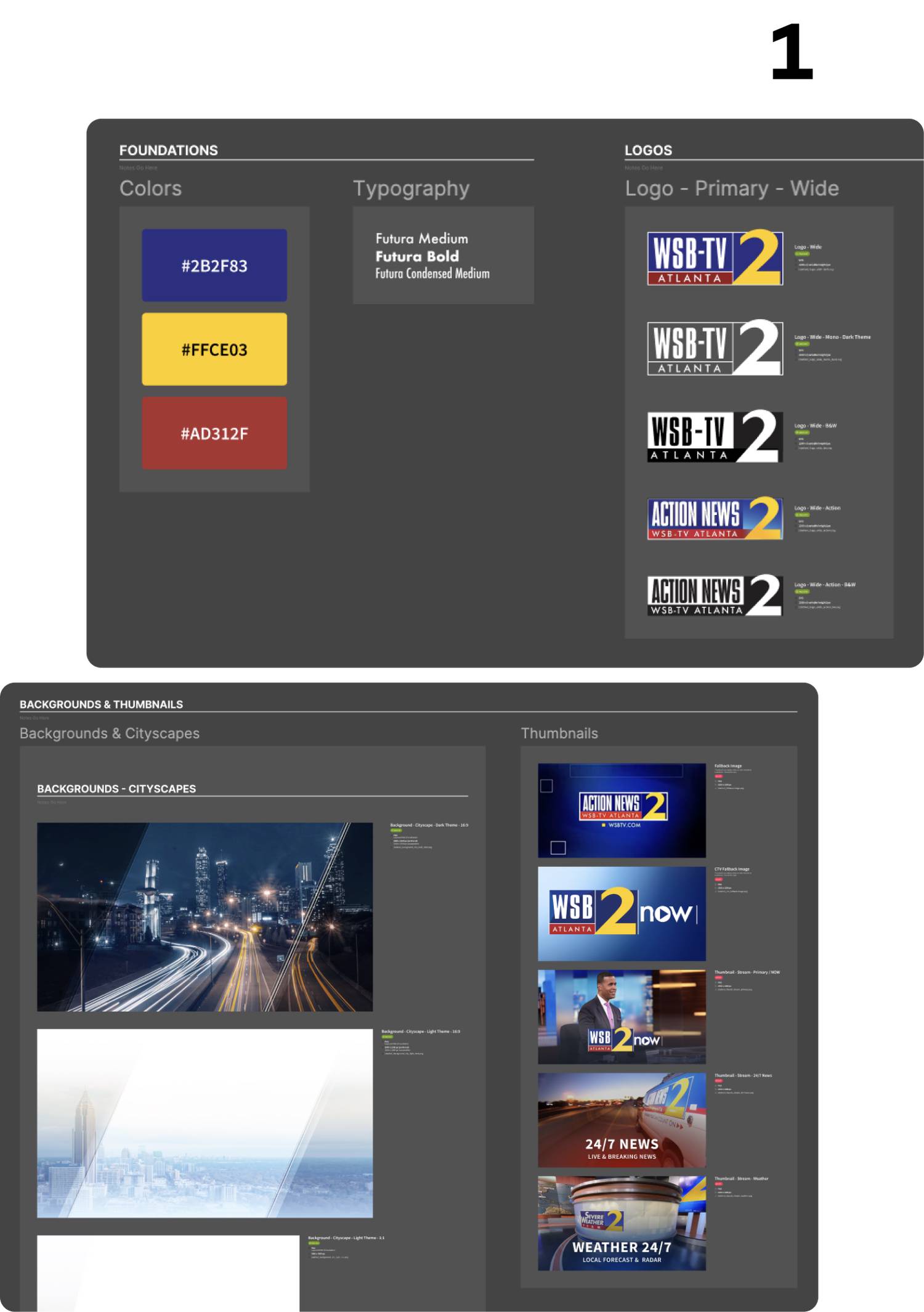
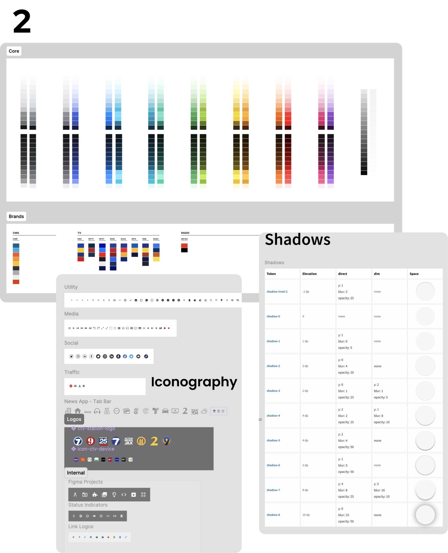
BRAND & STYLE GUIDE
MARKET RESEARCH
I looked into news brands like Washington Post, as well as media apps like Youtube. I also did an in-depth analysis on the NBA app, which was newly updated at the time.
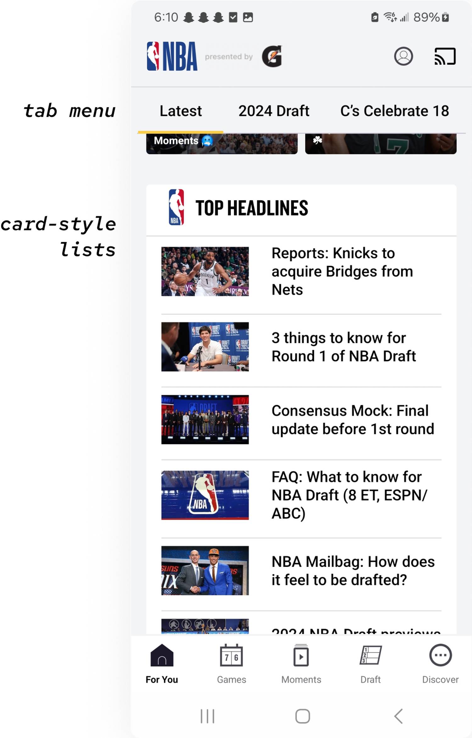
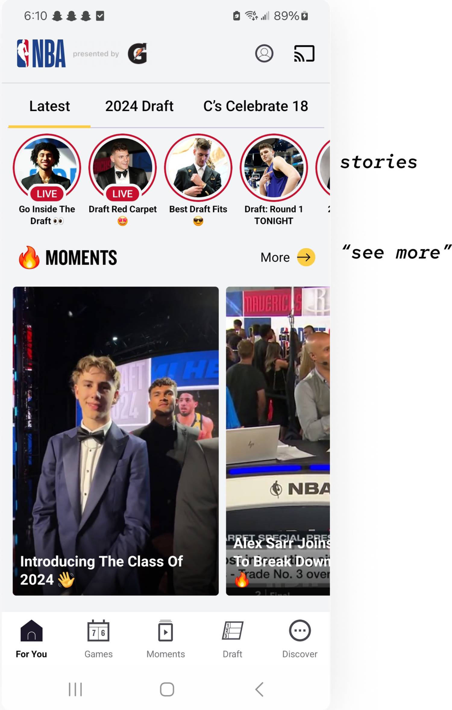
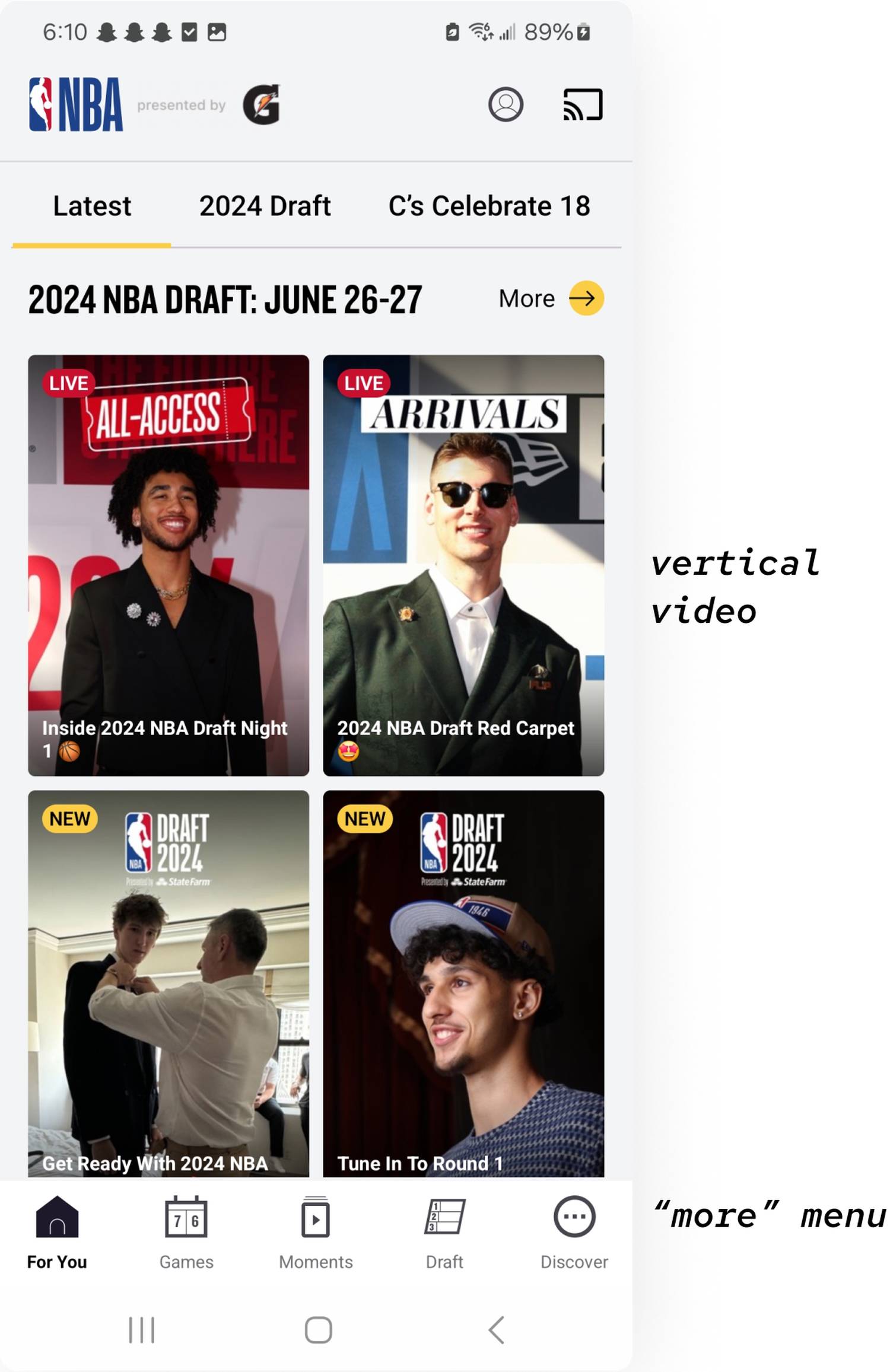
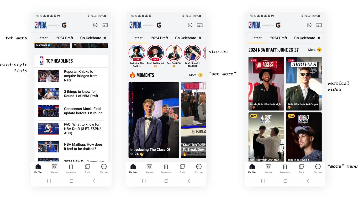
Keeping this in mind, I started designing the home page using inspiration from the layouts used in the NBA app. I also worked on improving the video page and menu. I created initial designs of various features and spent more time and resources on features that my team thought would be best to implement sooner, depending on time constraints, outside work, and developmental restraints.
IDEATION & INTIAL DESIGN CONCEPTS
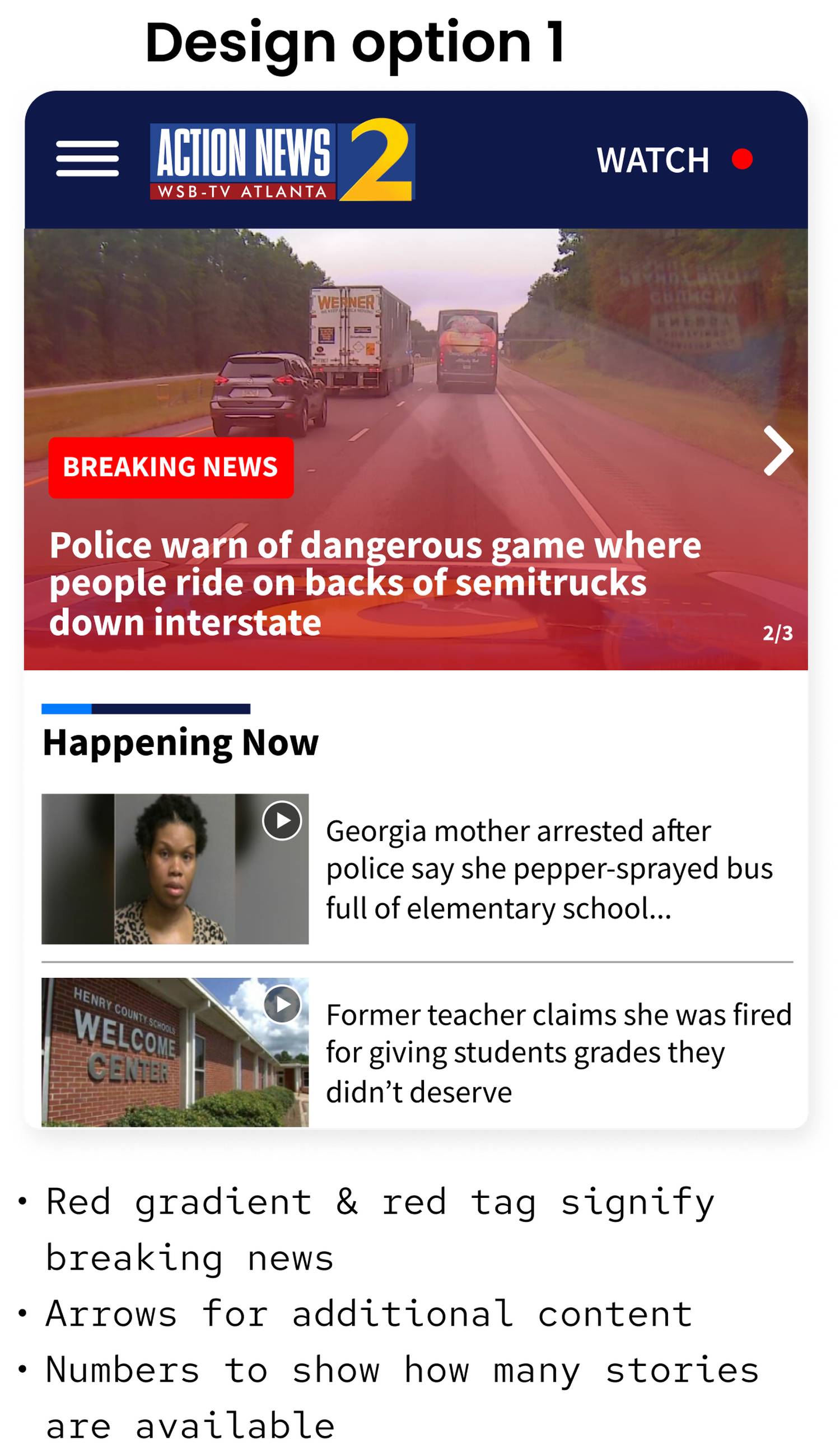
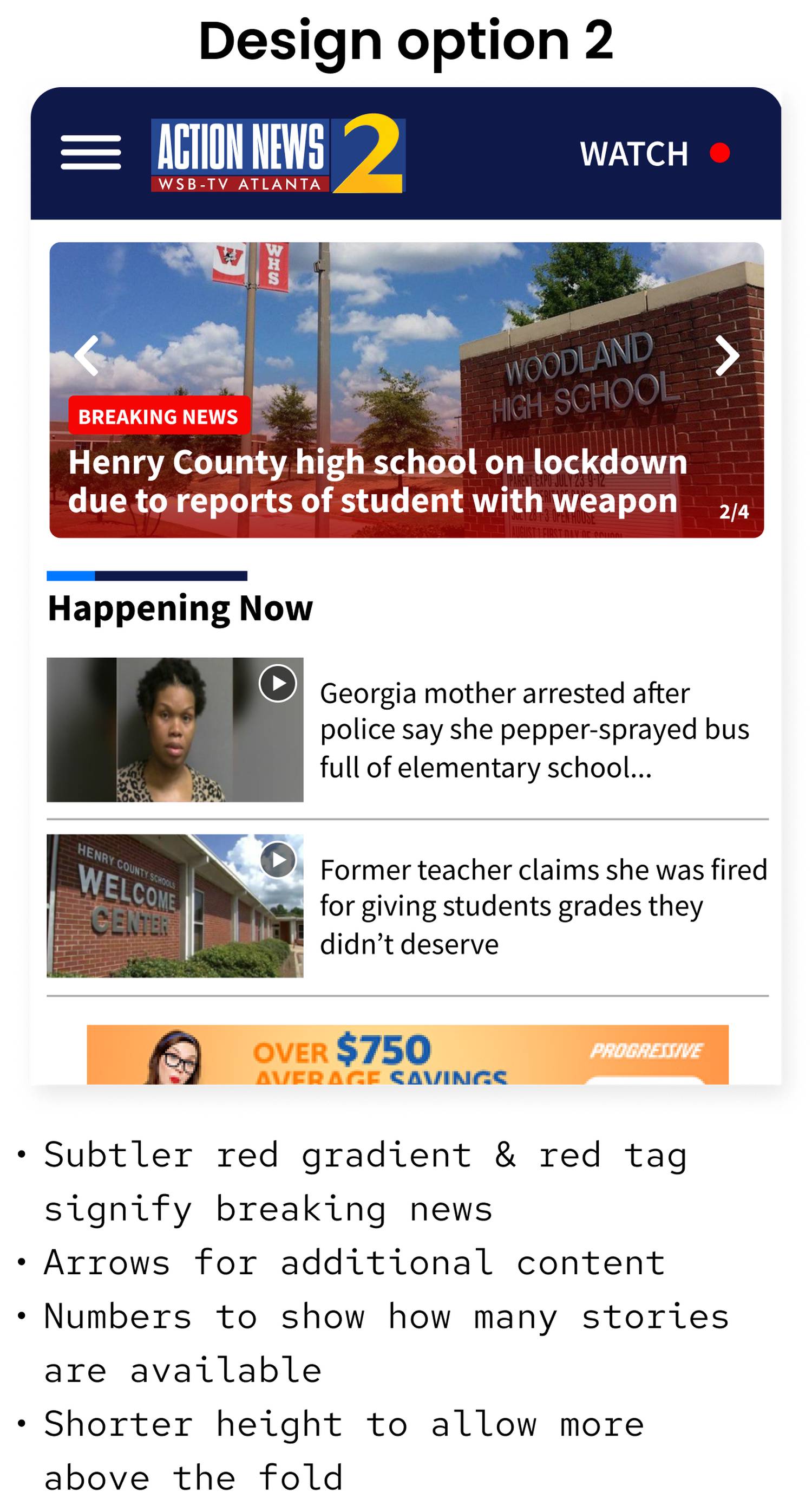
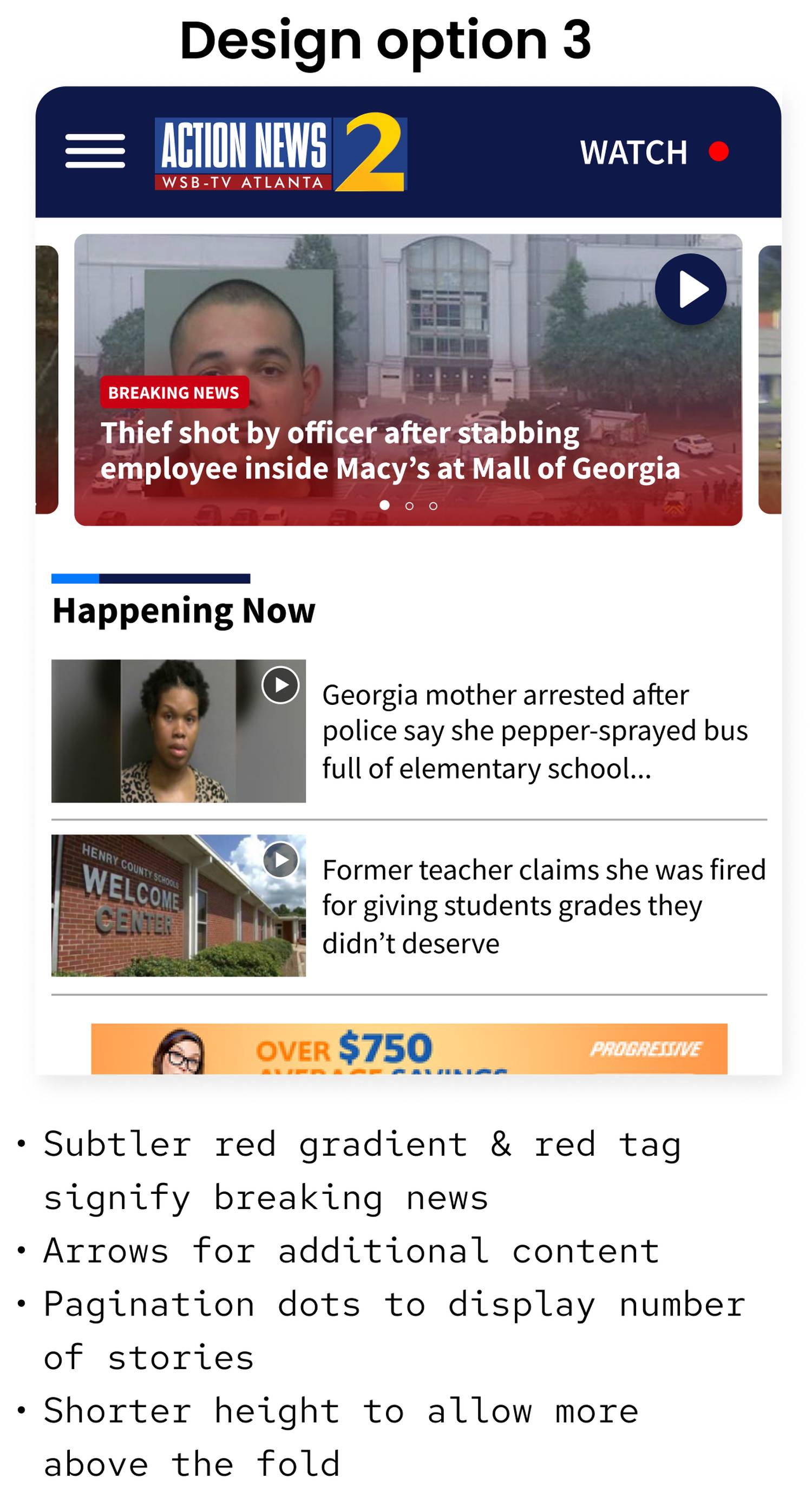
FEATURED BREAKING NEWS
IDEATION & INTIAL DESIGN CONCEPTS
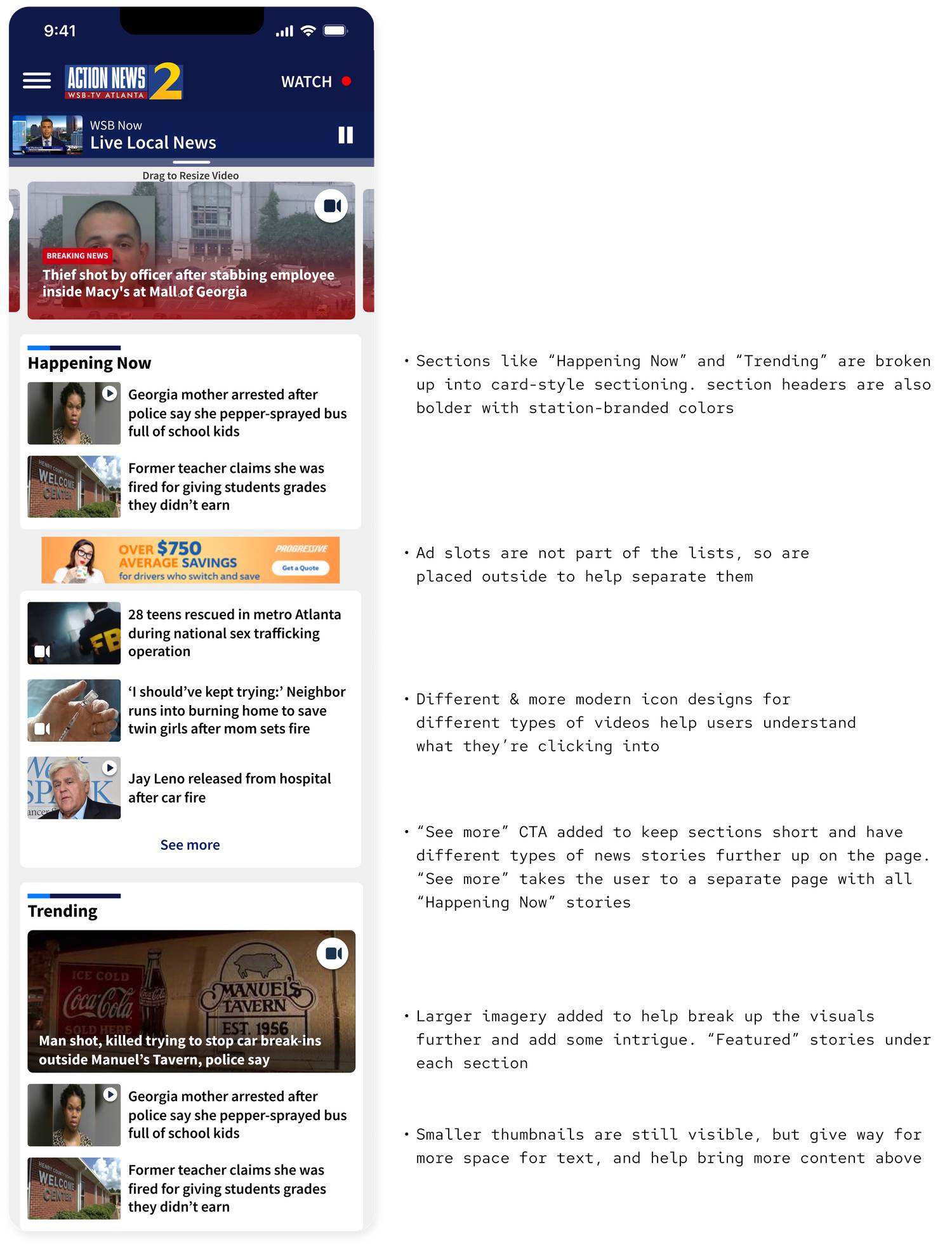
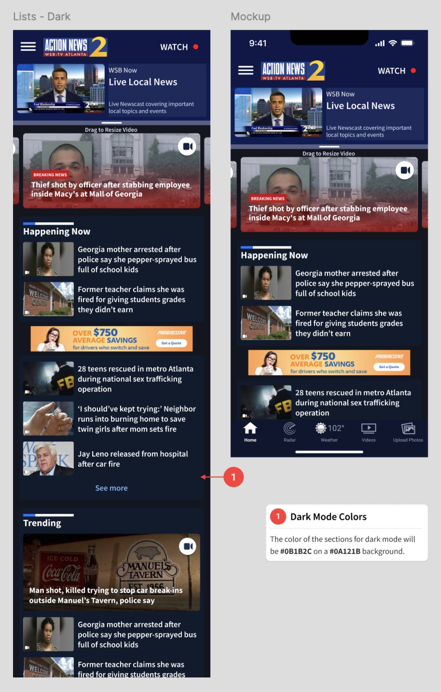
ARTICLE LISTS
IDEATION & INTIAL DESIGN CONCEPTS
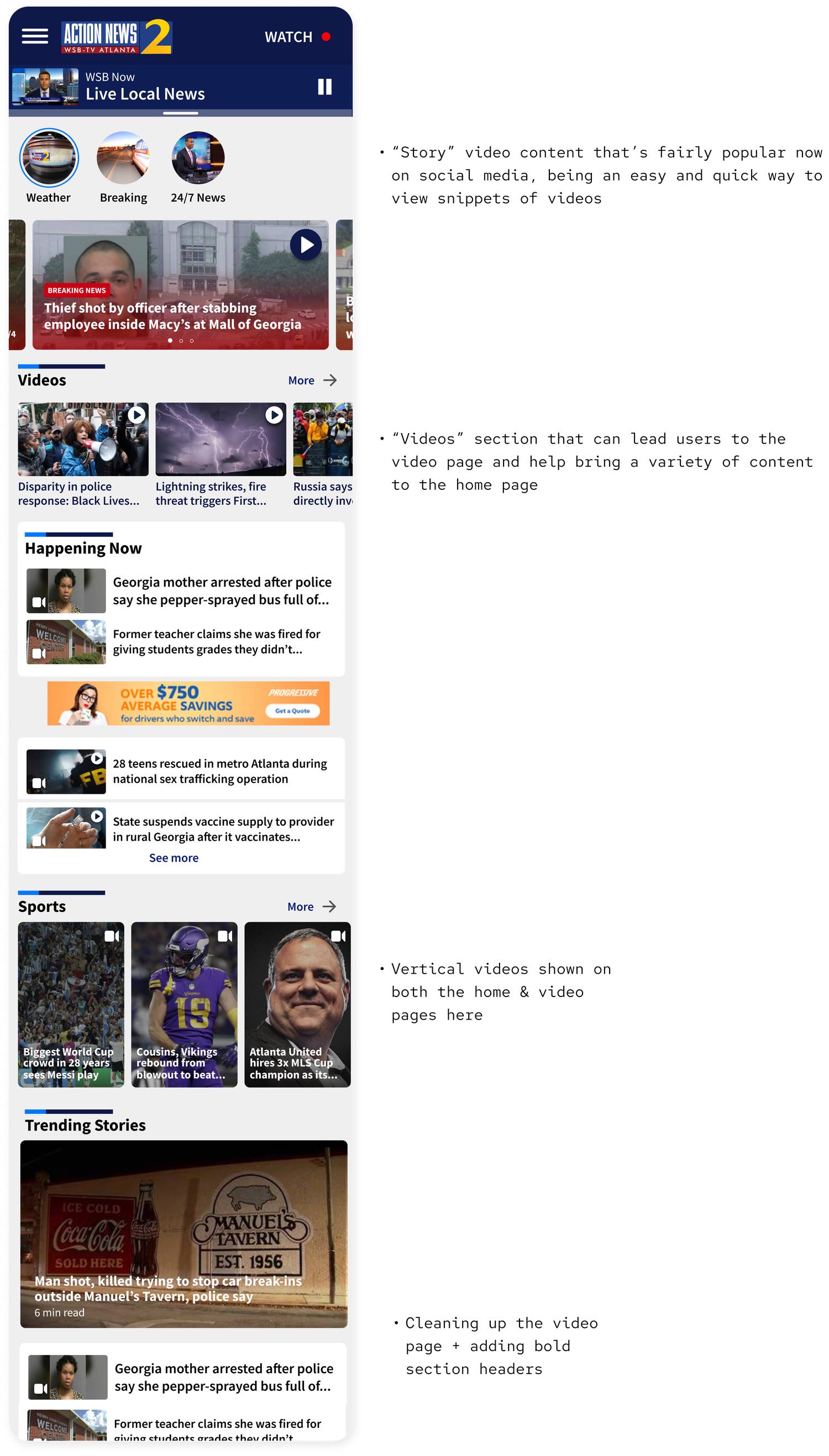
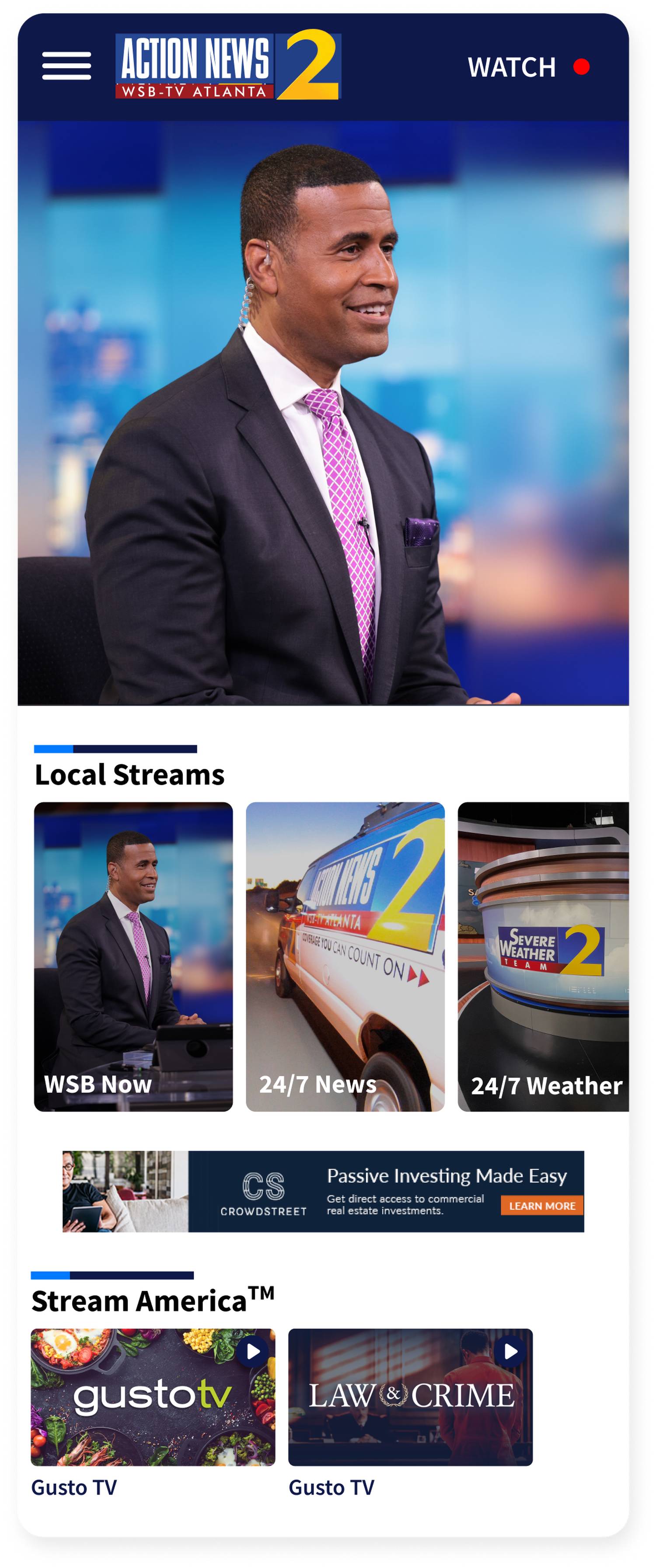
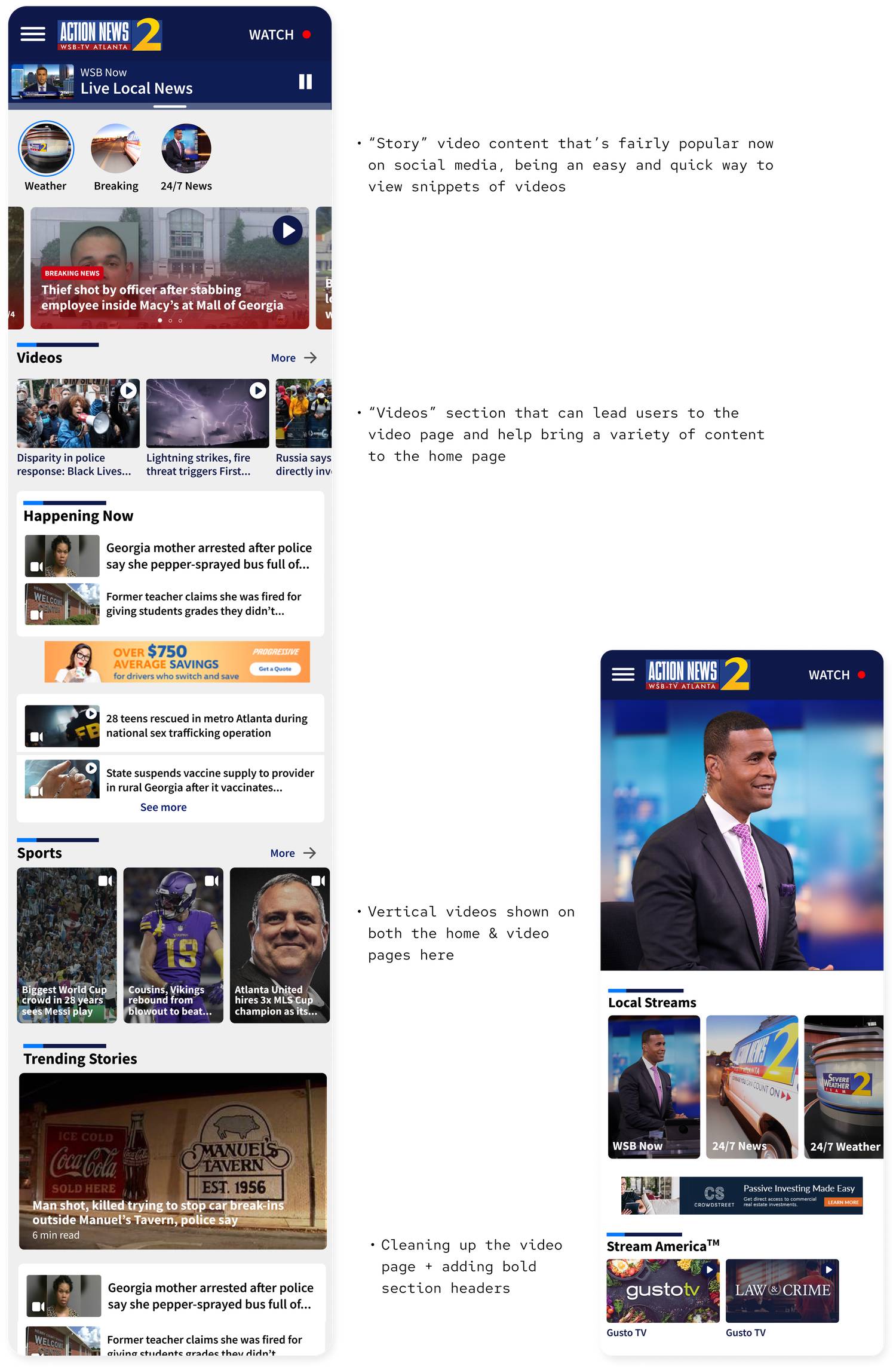
VIDEO CONTENT
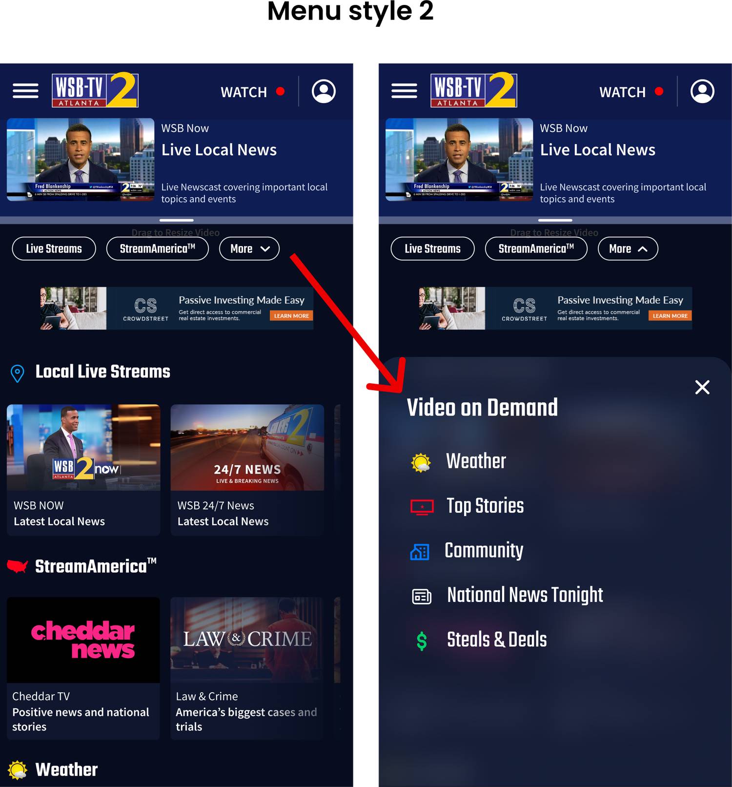
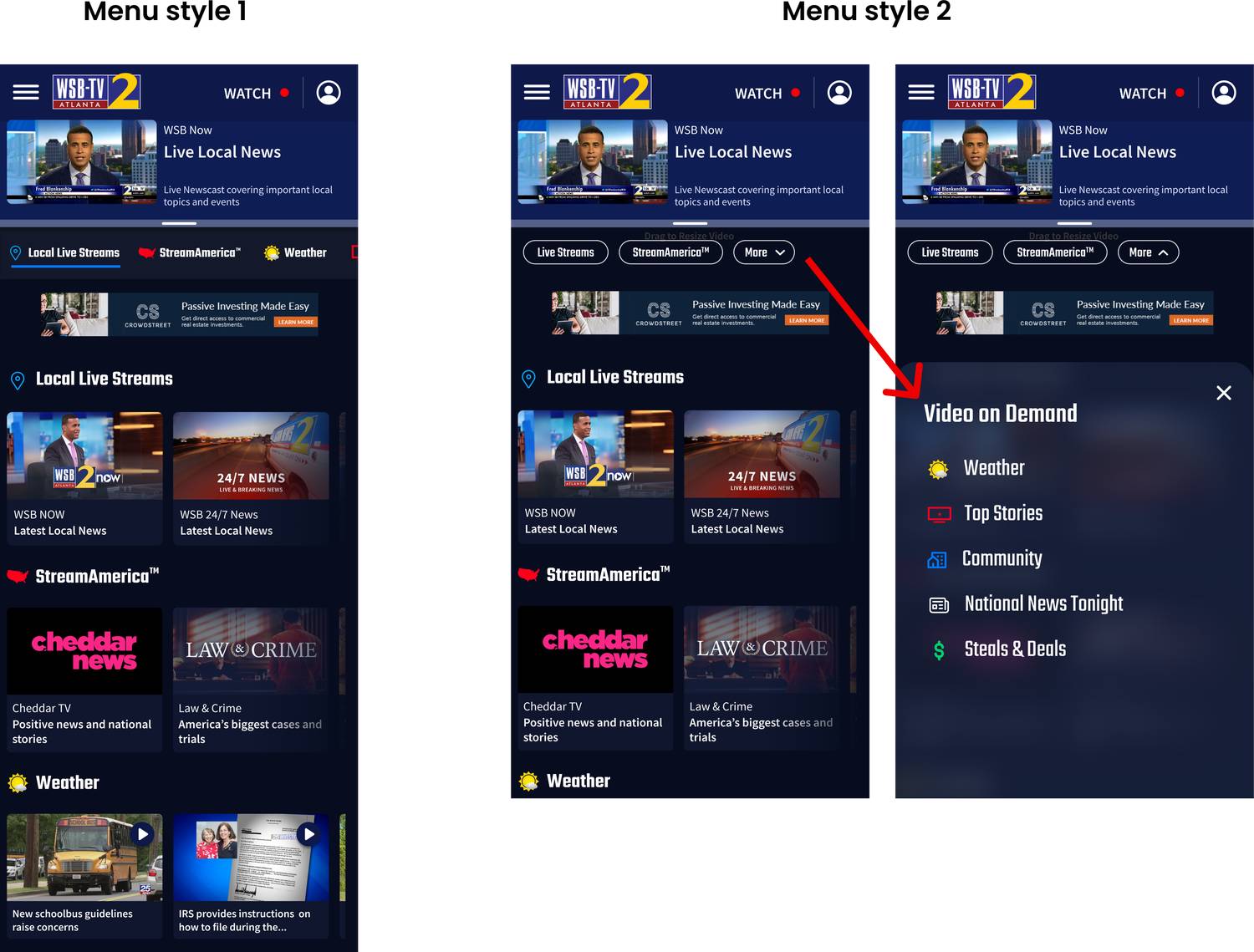
I also wanted to sort and clean up the video page, and help bring more traffic to it.
IDEATION & INTIAL DESIGN CONCEPTS
VIDEO CONTENT
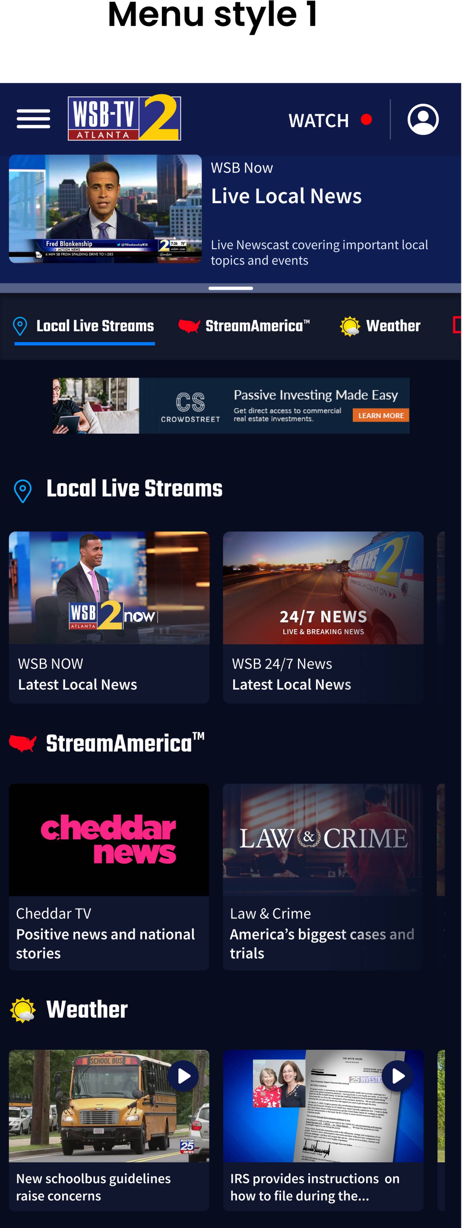
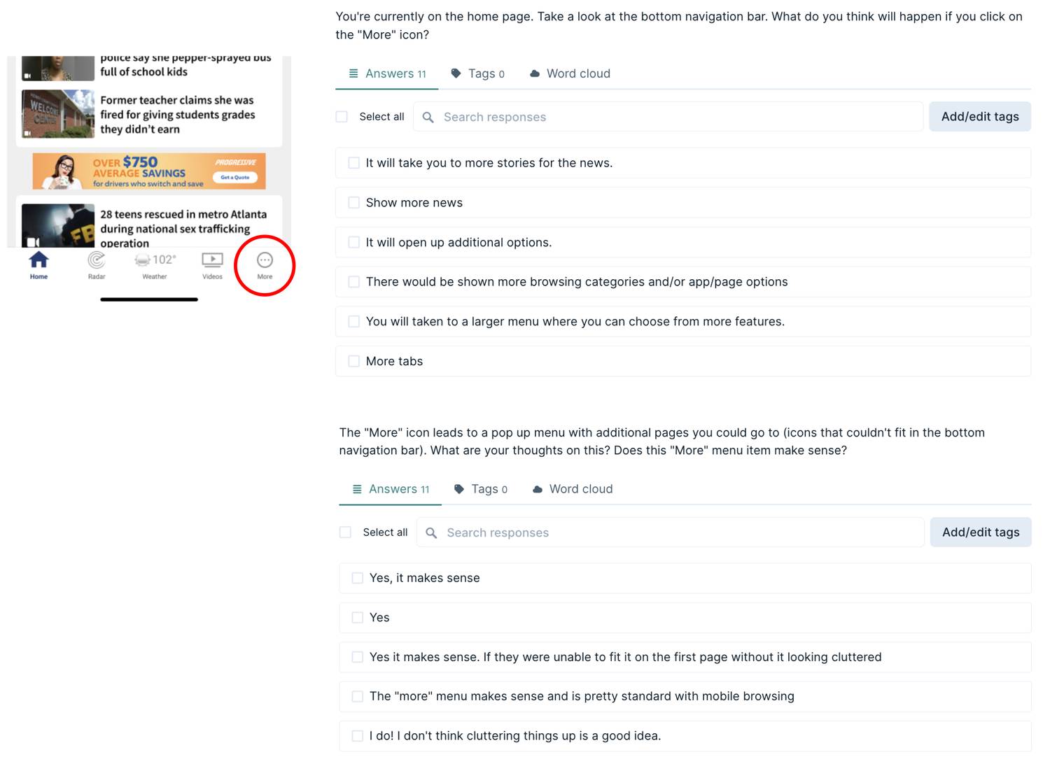
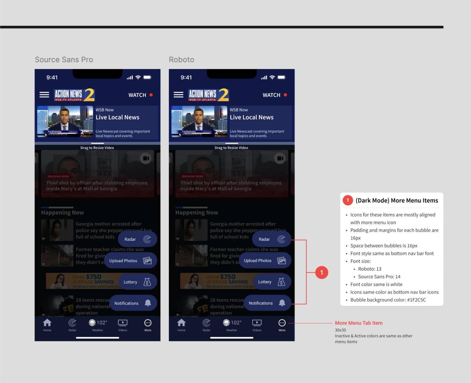
The first style is a horizontally scrolling tab bar with the menu items leading to each respective section. The second style uses few menu buttons and a drawer that opens up to reveal more sections, which can be more efficient if we have too many sections to scroll through. I was not able to test this feature before I left.
IDEATION & INTIAL DESIGN CONCEPTS
NAVIGATION



USABILITY TESTING
TESTS & RESULTS
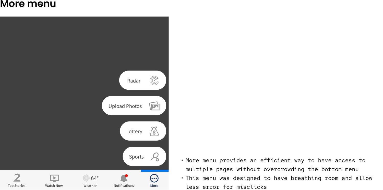
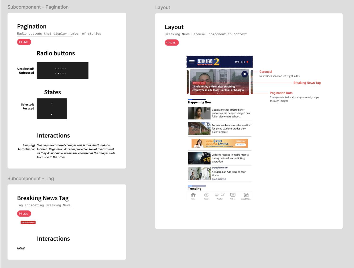
- Out of 15 participants, 11 preferred radio buttons over numbers to help signify their spot in the carousel (73%)
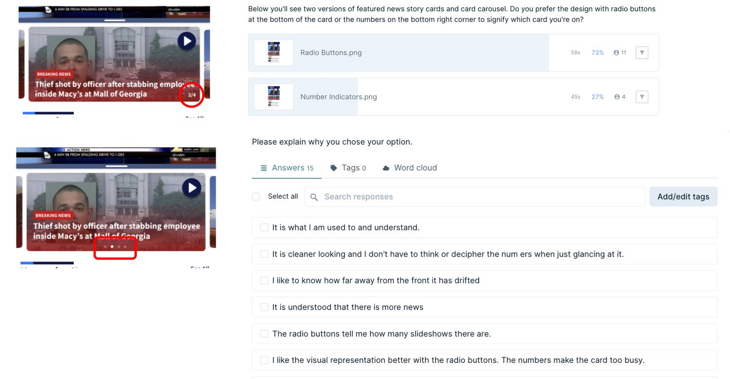
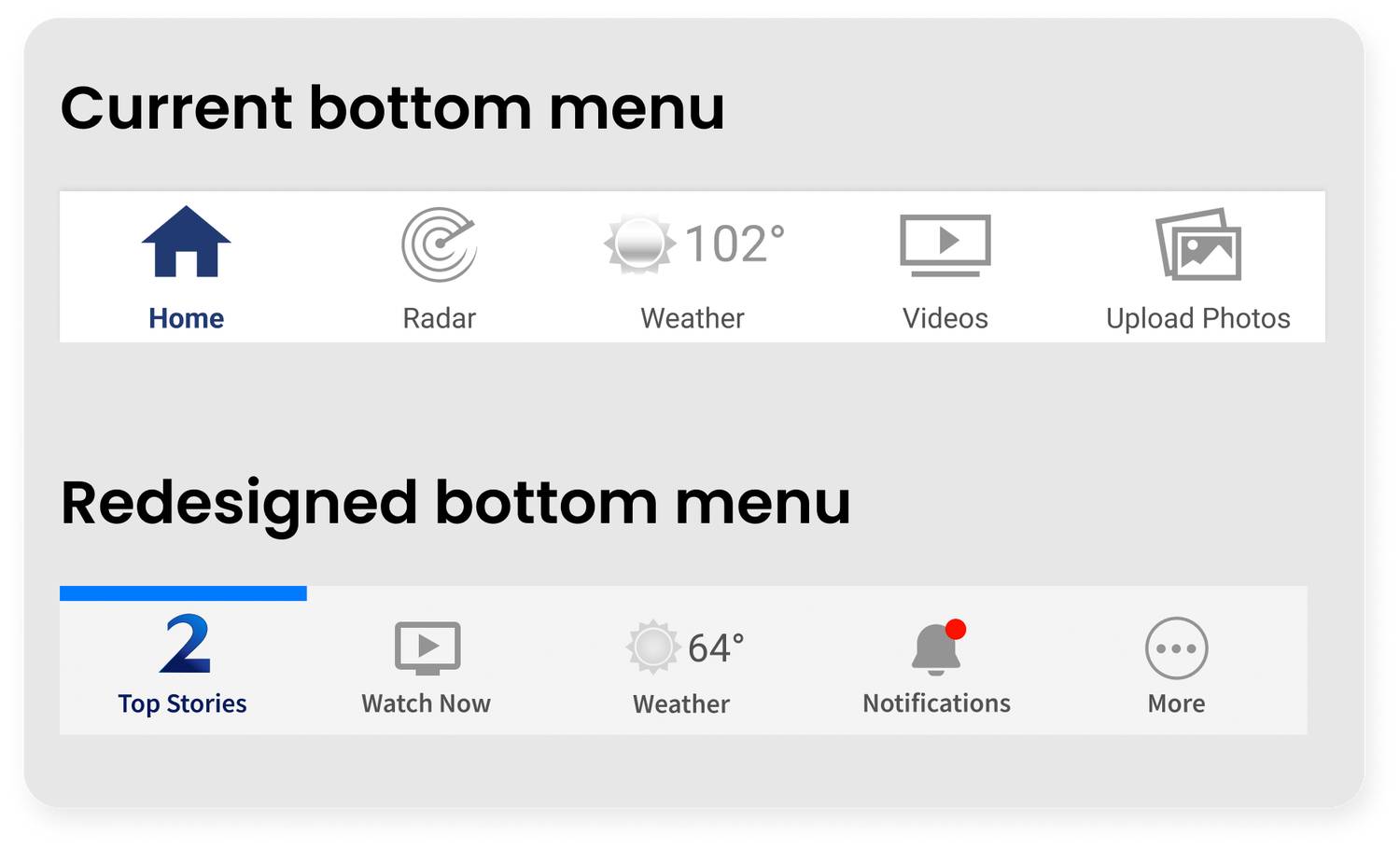
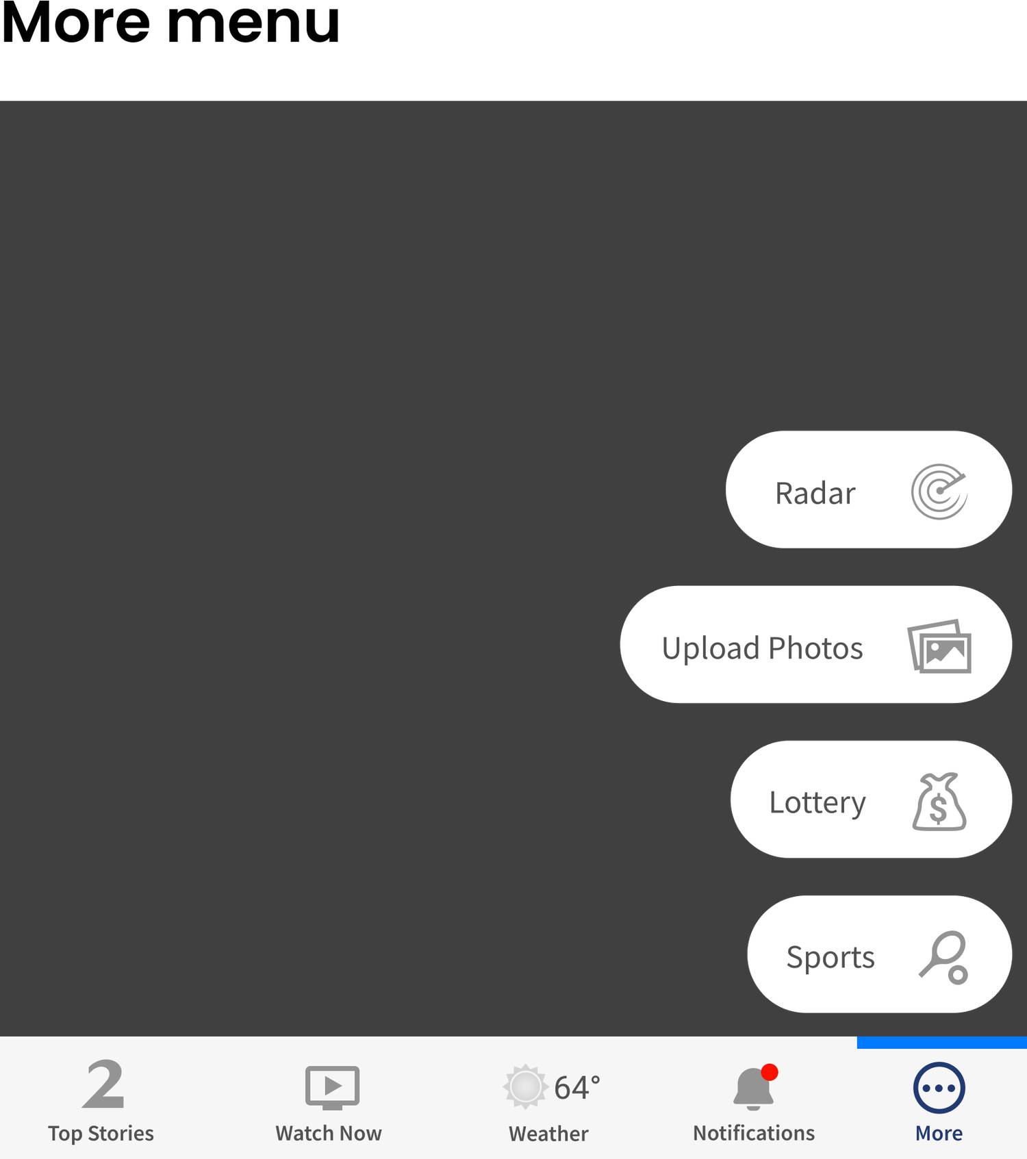
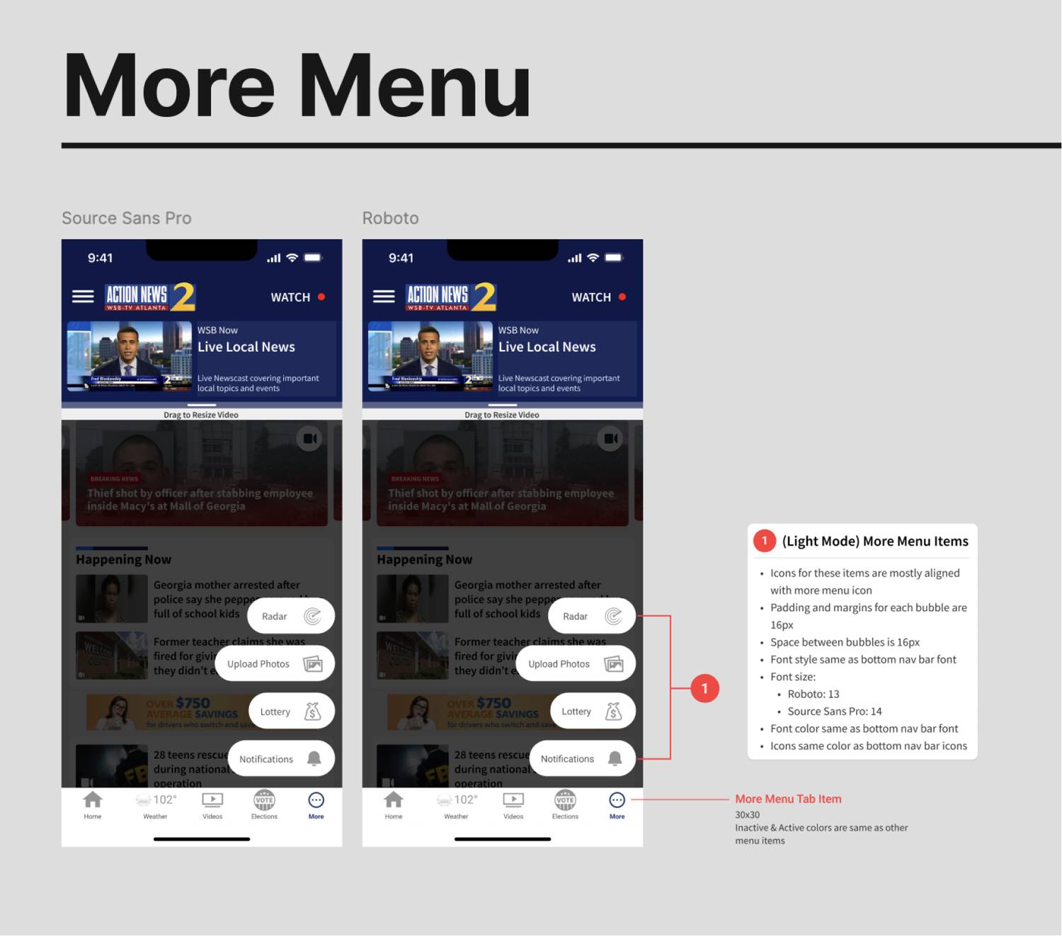
- Most participants believed that the "More" tab bar would open a menu with additional page options
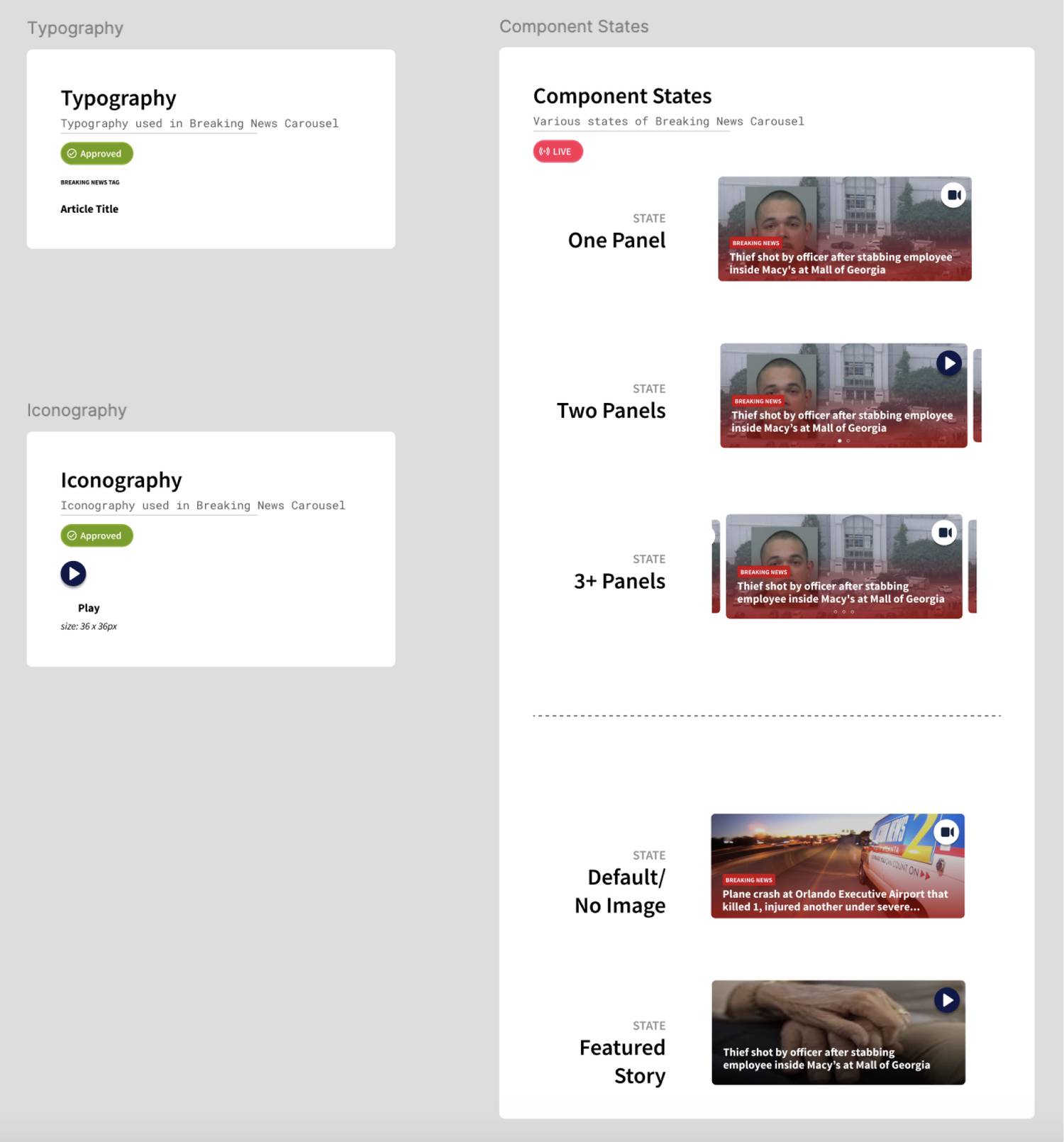
DESIGN DOCUMENTATION
FINAL THOUGHTS
What I would continue to improve upon:
- Adding categories/filters for story types so users can more easily sort through stories
- Adding commenting to videos & articles (I did design a successful article commenting feature for CMG's websites here)
- Push for better ad experiences. We started implementing sponsorships for some of our features, which are not as invasive
- Continuously working within stakeholder goals
- Working within development resources & constraints
- Working with various content, video, and legal teams
- Working with vast design libraries and a robust design system for multiple brands