 Website designed and developed by Amy Shah and Amin Halimah
Icon from Feather icons
User Engagement: Commenting Feature
Cox Media Group (CMG) owns a vast suite of websites and apps that provide breaking news and live coverage for each
of their news stations' areas. Specifically, as a UX designer, I helped design experiences for 15 TV stations and 50
radio stations around the US. The products we design are branded for each station (colors, logos), while being
consistent with the broader CMG brand's design system.
CMG's main goal is to provide reliable news coverage and keep audiences engaged. Audiences are able to hop on
anytime on their local station's website to engage with news articles, images, videos, and more. CMG's aim is to
create community in each of the areas it serves. This case study will reference our news sites, since those are our
main focus.
PROJECT SCOPE
SEPT 2023-MAY 2024
Team
Product Designer: Amy Shah
Product Manager: Judy P.
Design Director: Alex P.
Tools & Skills
Figma - Wireframing & Prototyping
Lyssna - Usability Testing
SiteImprove, Lighthouse - Accessibility
Jira - Organization
Tableau - Data Research
THE ASK
Keeping CMG's goals for its local communities in mind, my team was tasked with implementing a commenting
feature that brings perspectives from those living in the areas and communities we impact.
We also wanted commenting to open up discussions among readers and let users share their ideas and
engage with one another.
OUR PROCESS
- Identifying the UserUsers Goals & Interaction IdealsMarket Research
- OpenWebStakeholder Goals
- Initial DesignsTests & Results
- Final Comment FeatureDocumentation
IDENTIFYING OUR GOALS
IDENTIFYING THE USER
Along with location, CMG's audience profile is as follows:
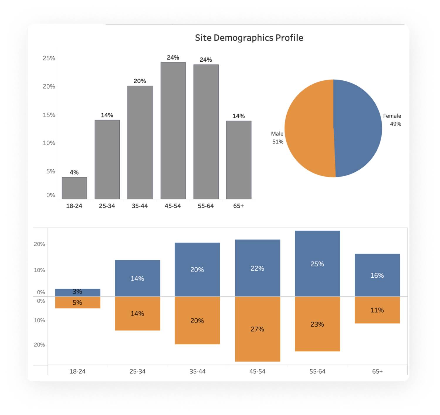
- 51% male vs 49% female audience
- Most users skew older, between 35 and 64
IDENTIFYING OUR GOALS
USER GOALS &
INTERACTION IDEALS
Users' front door into our websites are the news stories.
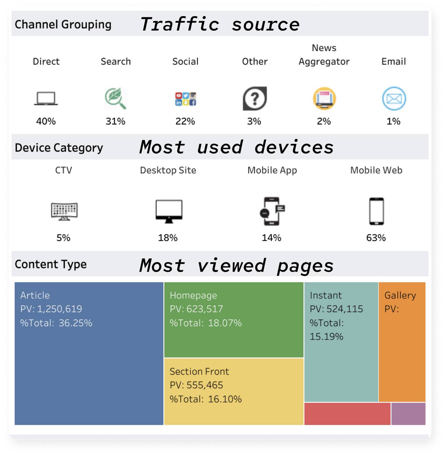
The addition of a commenting feature allows users to interact more thoughtfully to individual stories. Interaction ideals include:
- One or more places where users can easily access comments
- Separate comment section
- Ease of reading and writing comments
- Appropriate & on-topic conversations
- Many users go straight for the comments before completing a story
- Many users may want to see/write comments once they have read the full story
IDENTIFYING OUR GOALS
JOURNEY MAP

IDENTIFYING OUR GOALS
MARKET RESEARCH
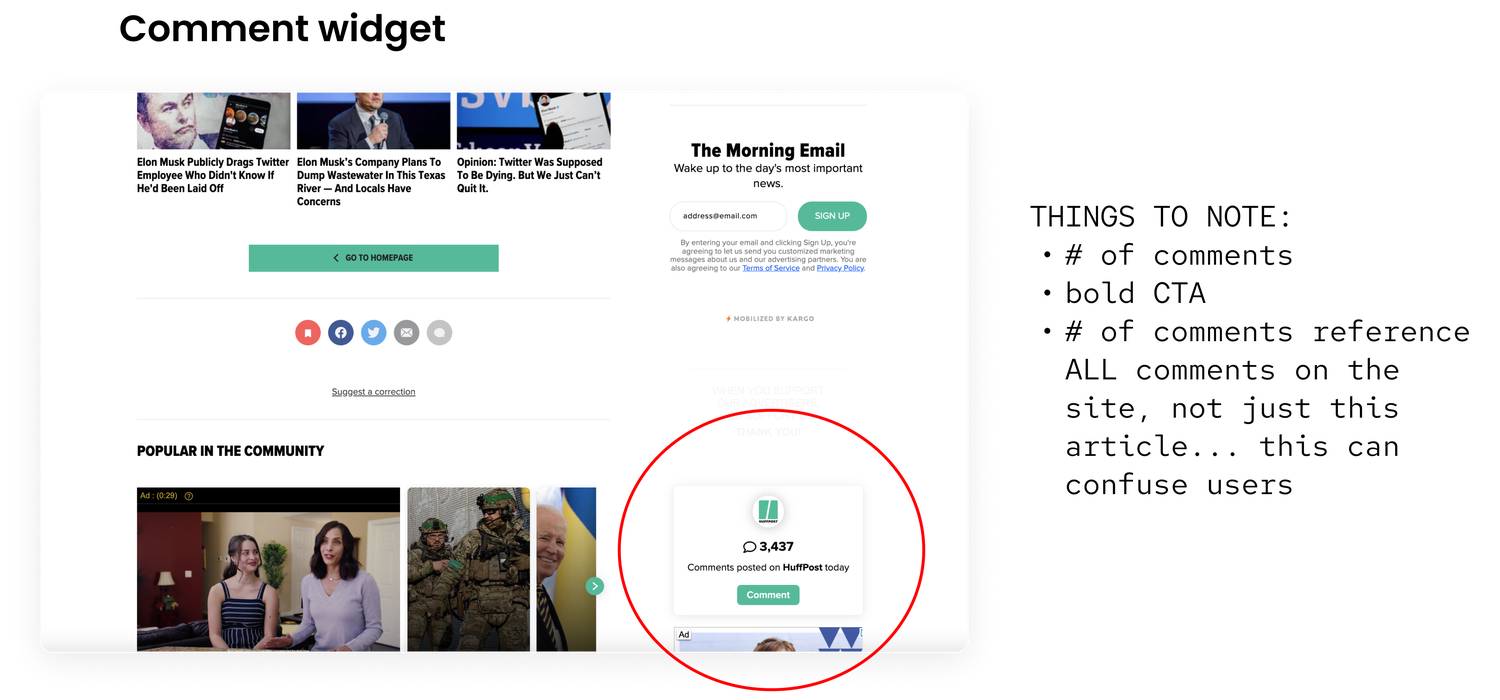
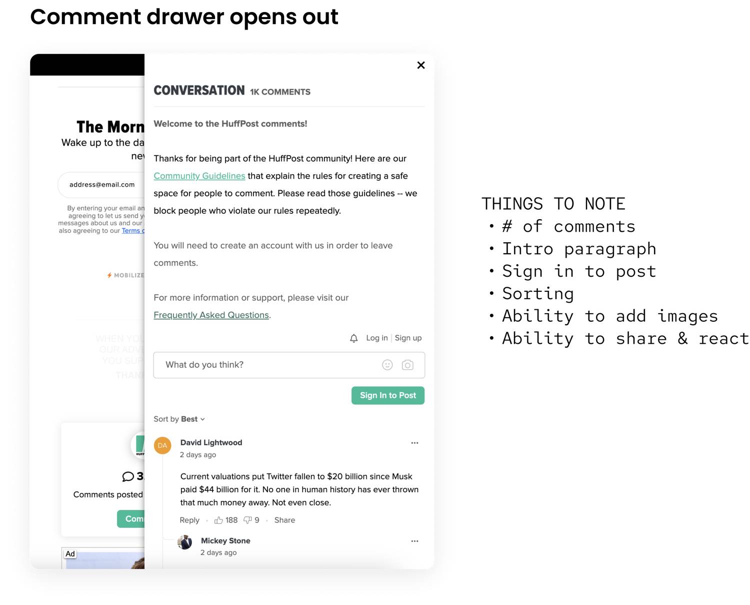
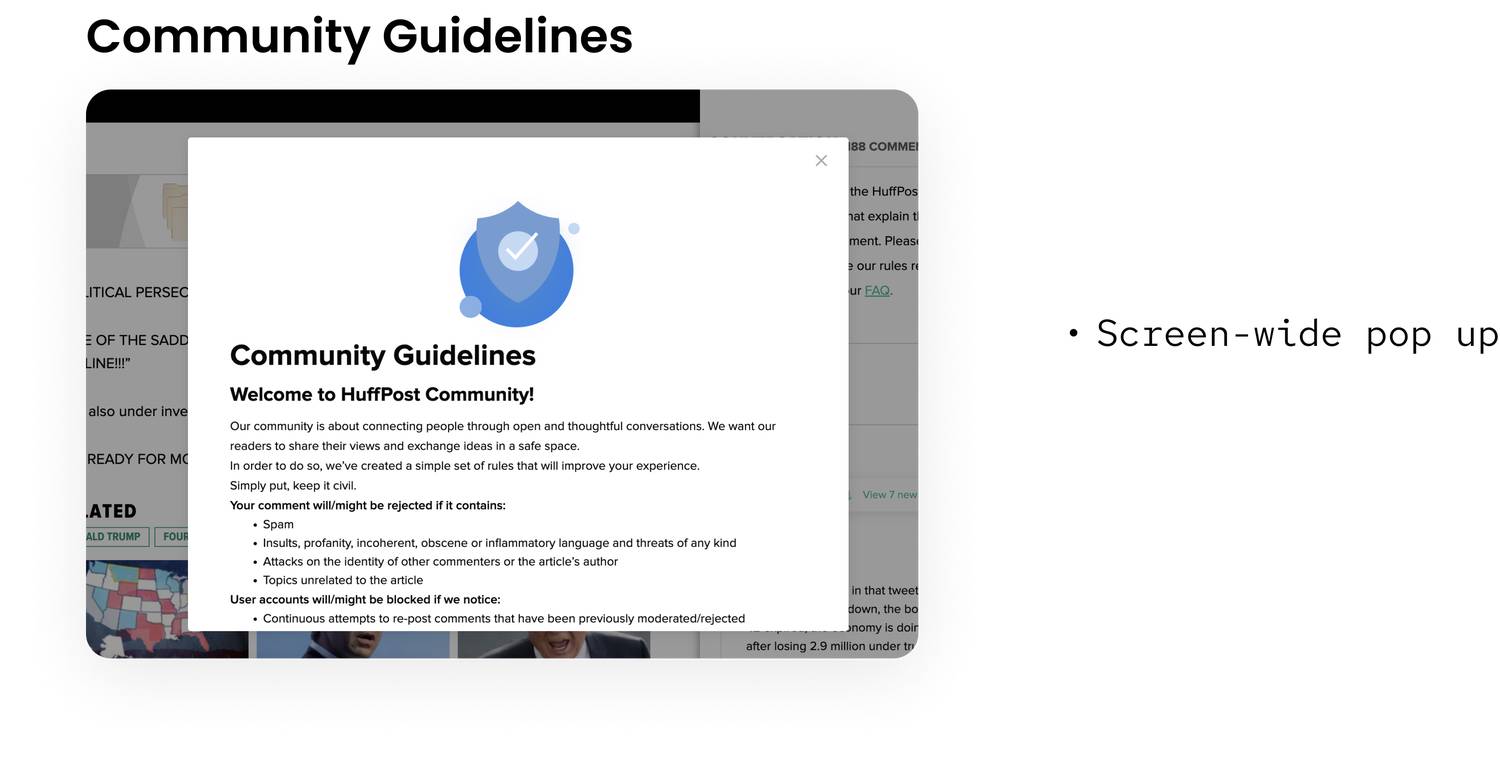
I primarily researched news sites and video platforms like YouTube to see how the commenting features were laid out and used. I analyzed HuffPost more than others due to it being a news website and its use of OpenWeb - the vendor we were planning to build this feature with.
KNOWING OUR CONSTRAINTS
OPENWEB
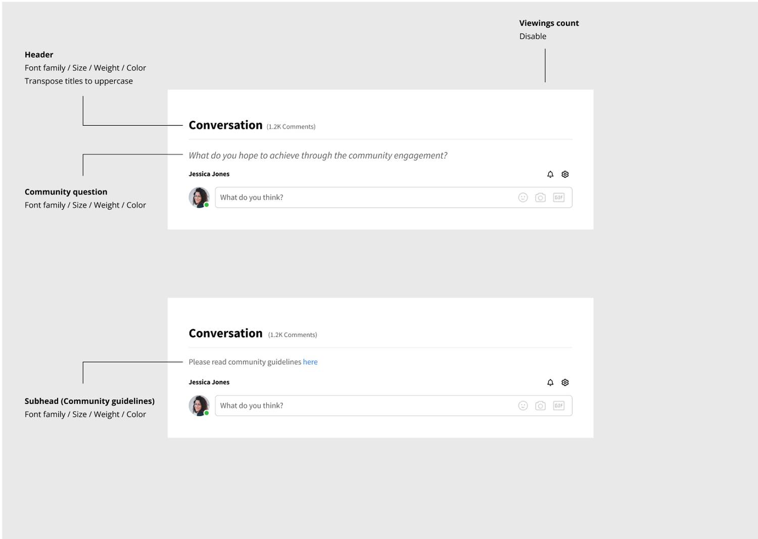
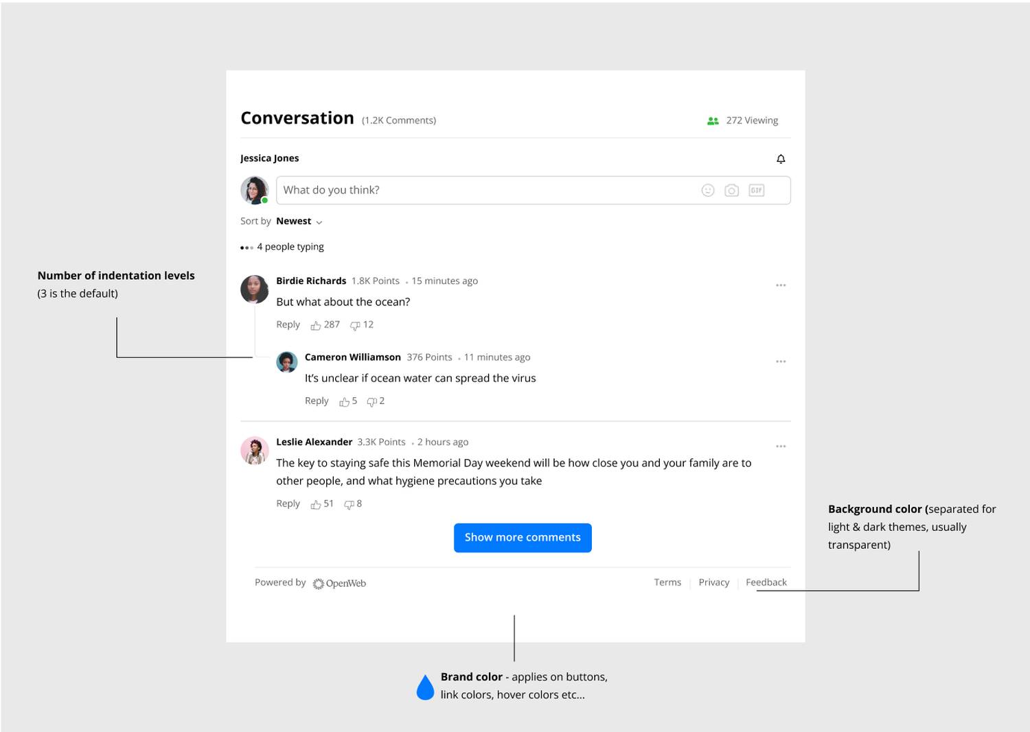
OpenWeb's commenting features include:
- Drawer that opens out when user prompts
- Ability to comment, react, reply, filter, and share
- Ability to connect to brands and content through profiles and accounts
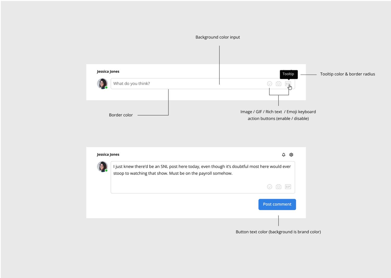
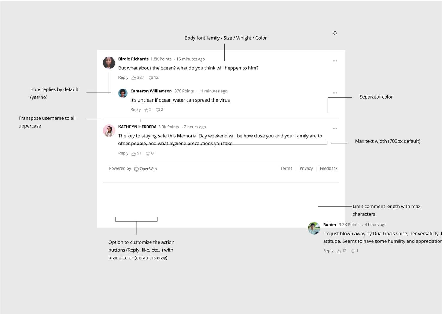
- Ability to customize features, colors, text
OpenWeb features & customization provided by their team
KNOWING OUR CONSTRAINTS
STAKEHOLDER GOALS
- Branding where/when possible
- Brand consistency
- Compliance with OpenWeb's constraints
- Compliance with legal vocabulary
- Deadlines: May 30th rollout on all sites, mid-March proof-of-concept launch for one station, WHIO (Ohio)
USABILITY TESTING
INITIAL DESIGNS
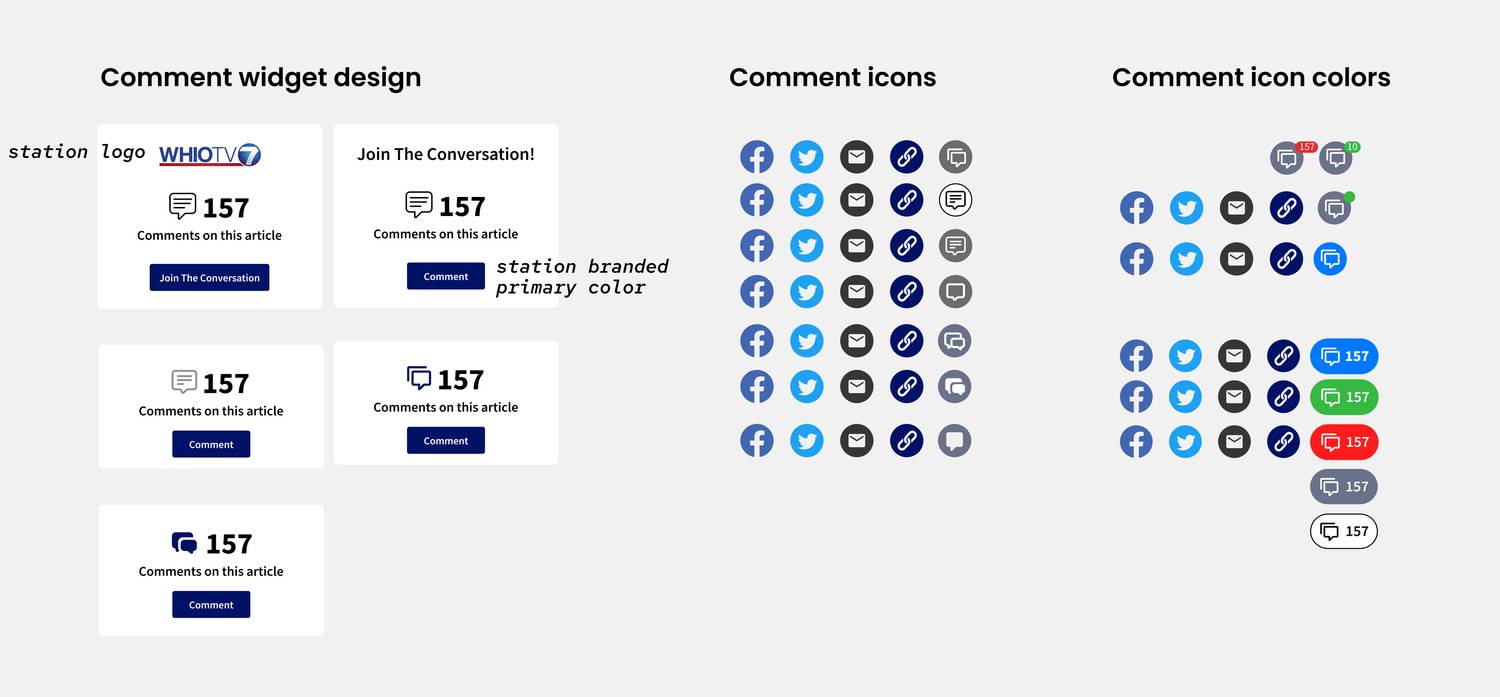
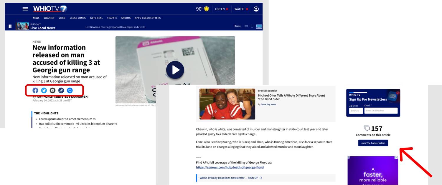
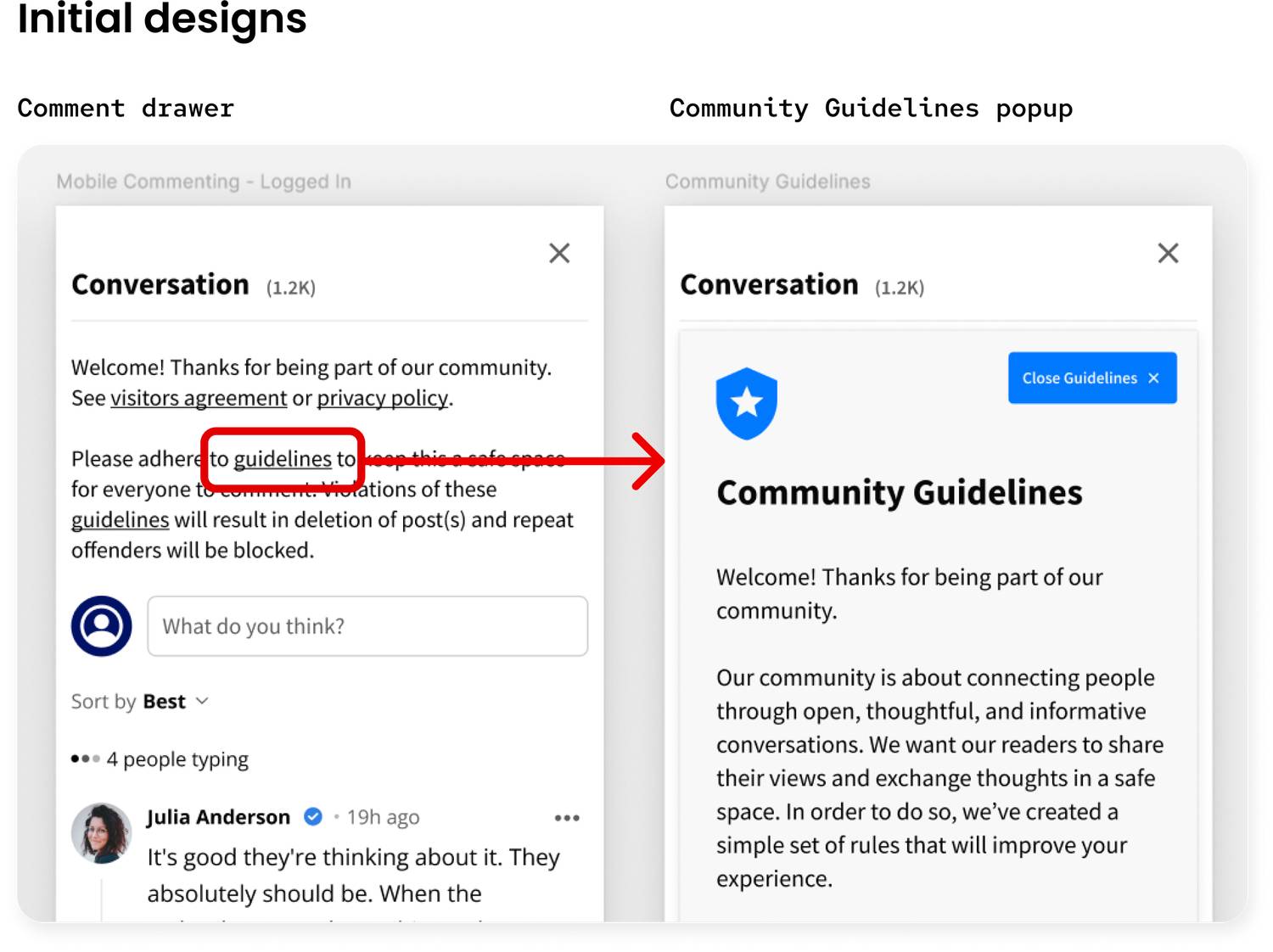
Since the comment drawer & logistic features were going to be based on designs OpenWeb provided, my main design task was to create & test the widgets that allowed users to access the comments.
I considered:
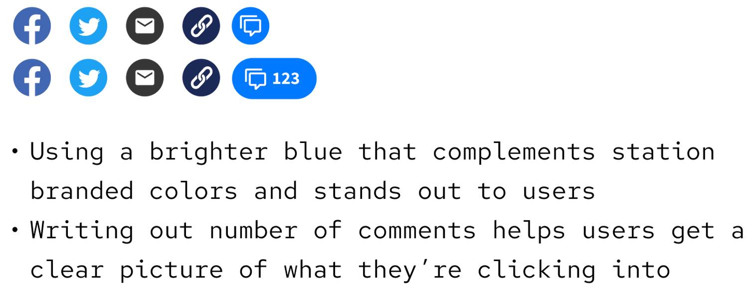
- Which icon and color stand out & accomplish the goal the most?
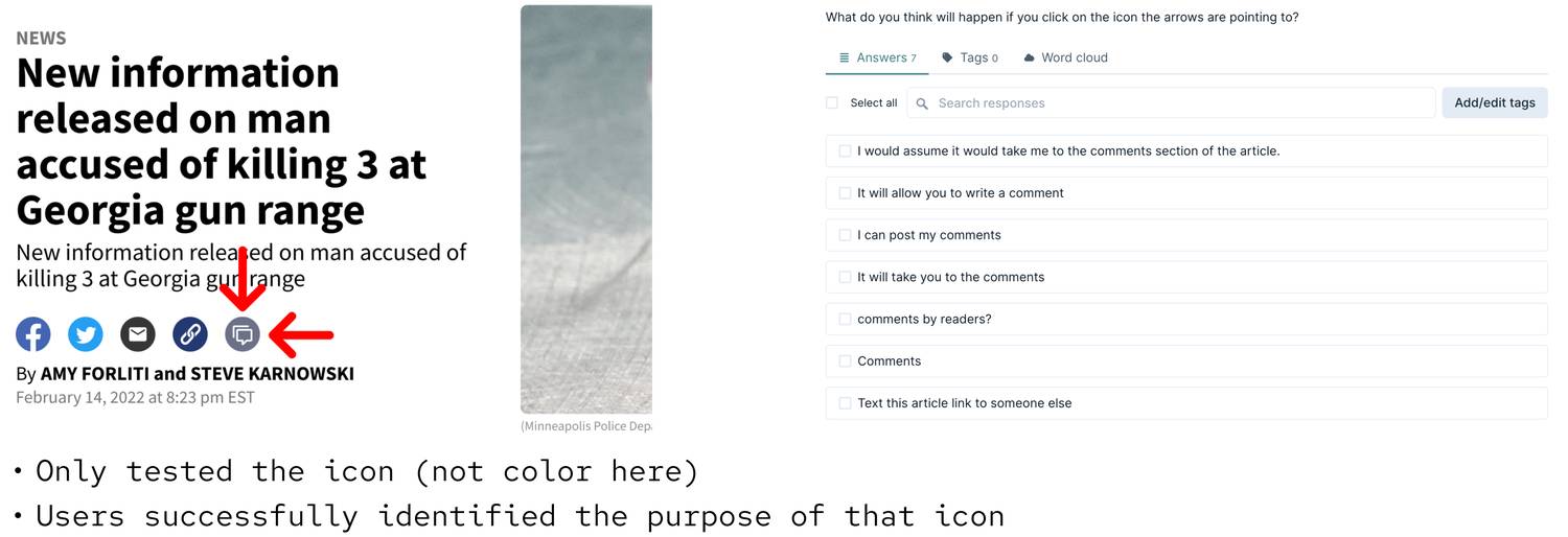
- My team and I believe the first icon provided a clearer indication of comments & tested this
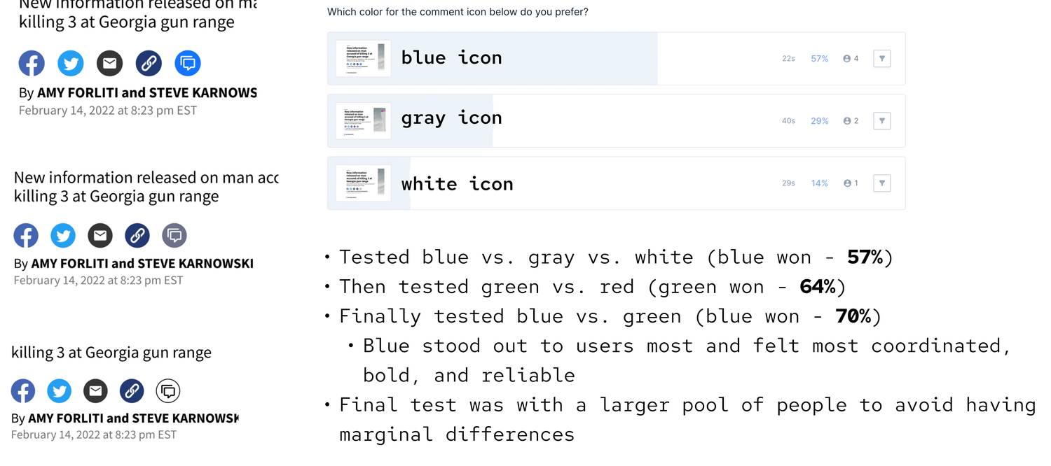
- For colors: gray & white act as neutral, blue complements station branded blues, red & green represent different emotions and stand out
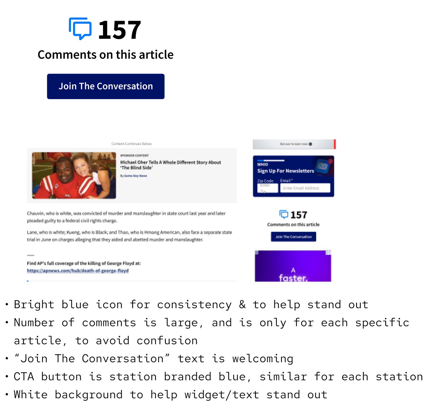
- What phrasing prompts the user to comment?
- How should we add branding to this?
USABILITY TESTING
TESTS & RESULTS
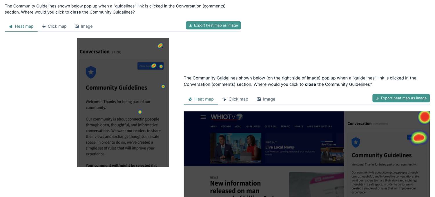
I conducted testing through a tool called Lyssna (previously UsabilityHub). Lyssna provides a variety of testing methods, such as card sorting, preference testing, heat maps, and user interviews. For our questions, I found preference testing/surveying most suitable. I typically test on a pool for 7-15 participants, depending on the likelihood of 50/50 results.
- Tested on mobile & desktop
- Users clicked on both close buttons
- Users mental schemas describe that "X" = close, and will immediately go for that
- Since "X" is to close the drawer, we need to find a workaround
Heatmap
FINAL DESIGN & DOCUMENTATION
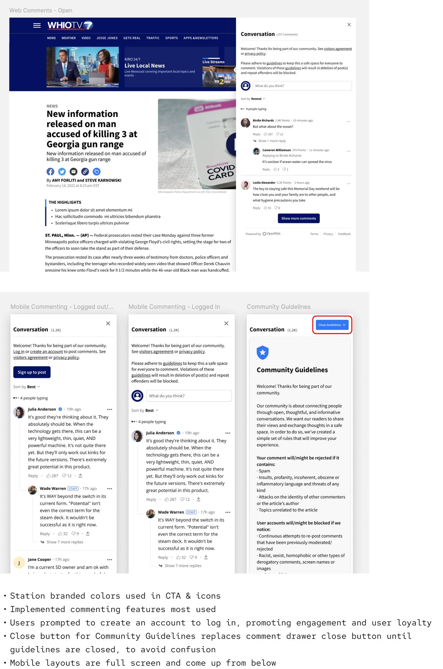
FINAL COMMENT FEATURE
After reviewing user feedback across iterations of designs, we added more to improve visibility of our commenting feature. We also improved upon initial designs based on testing.
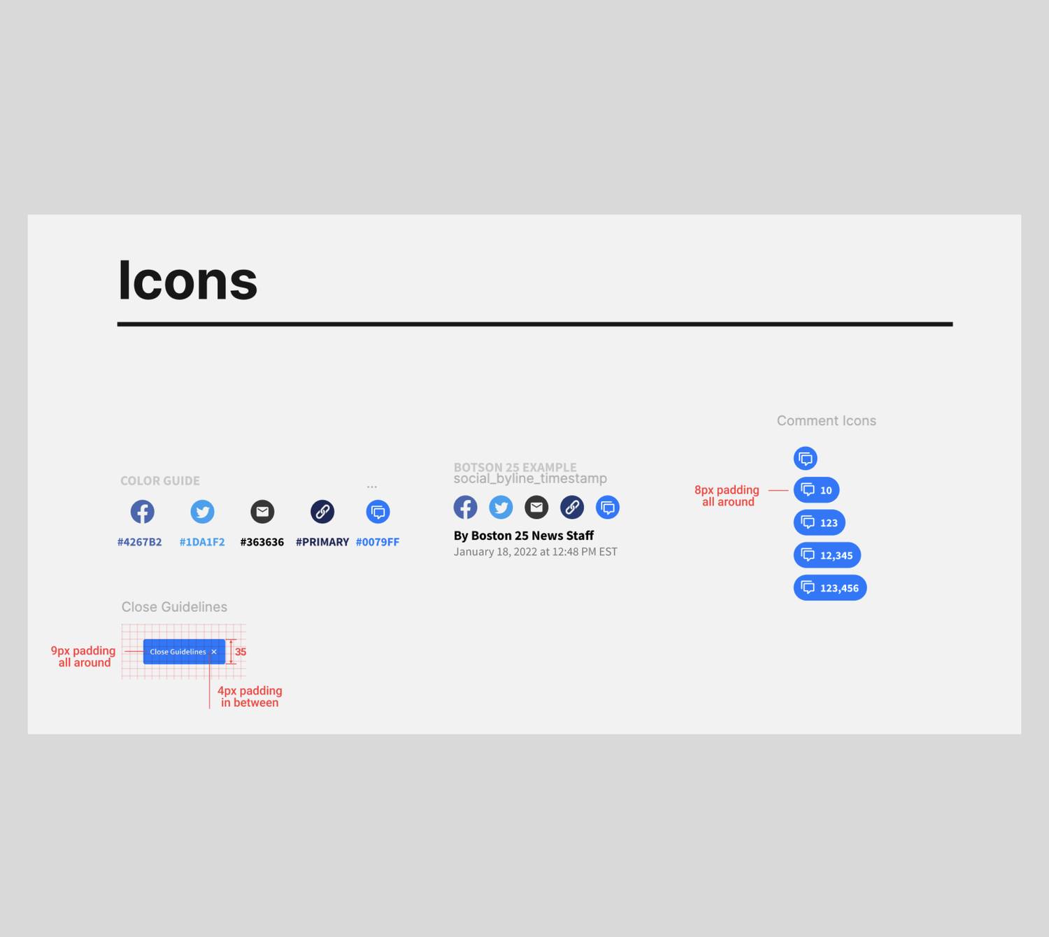
Comment Icon
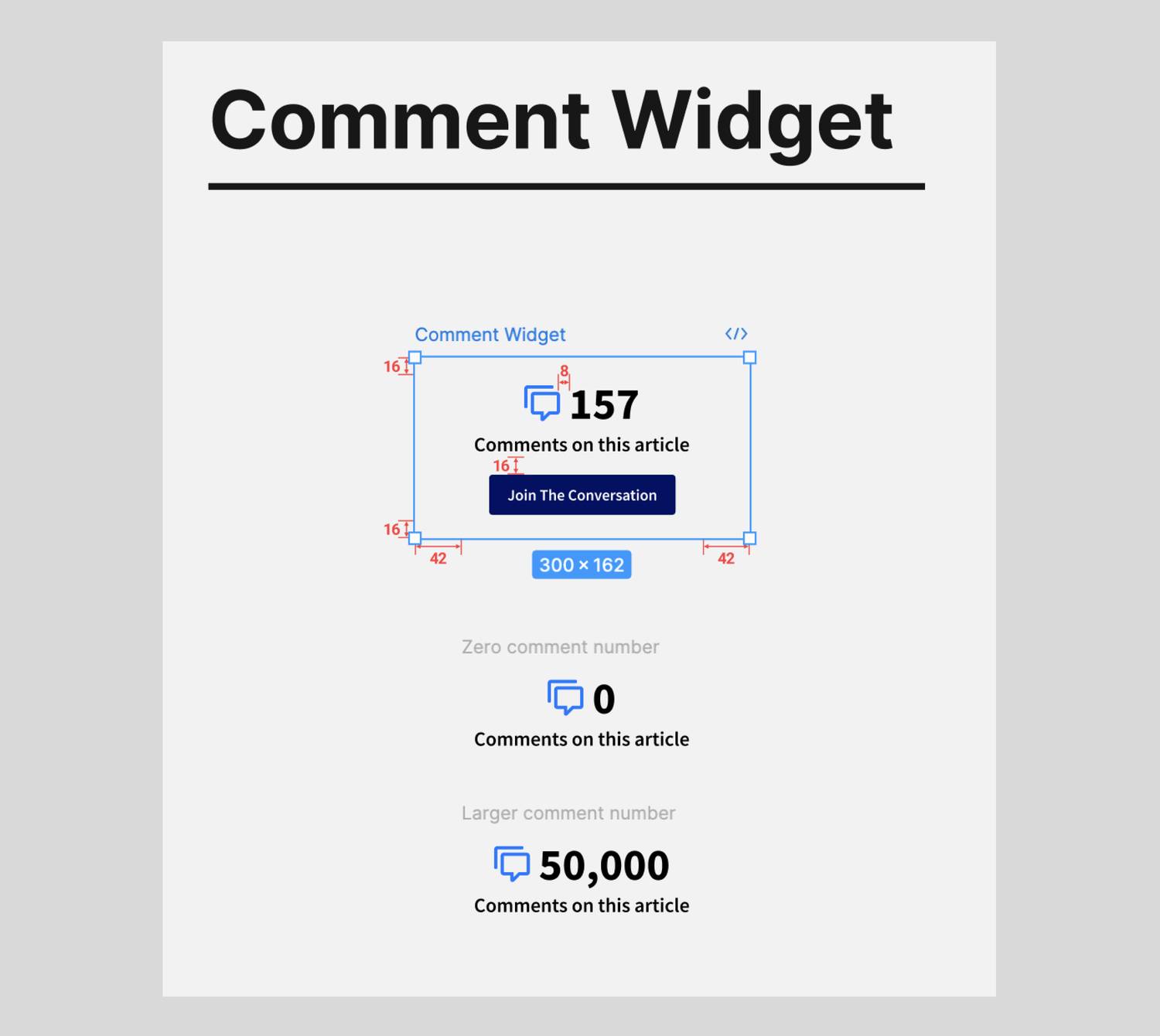
Comment Widget
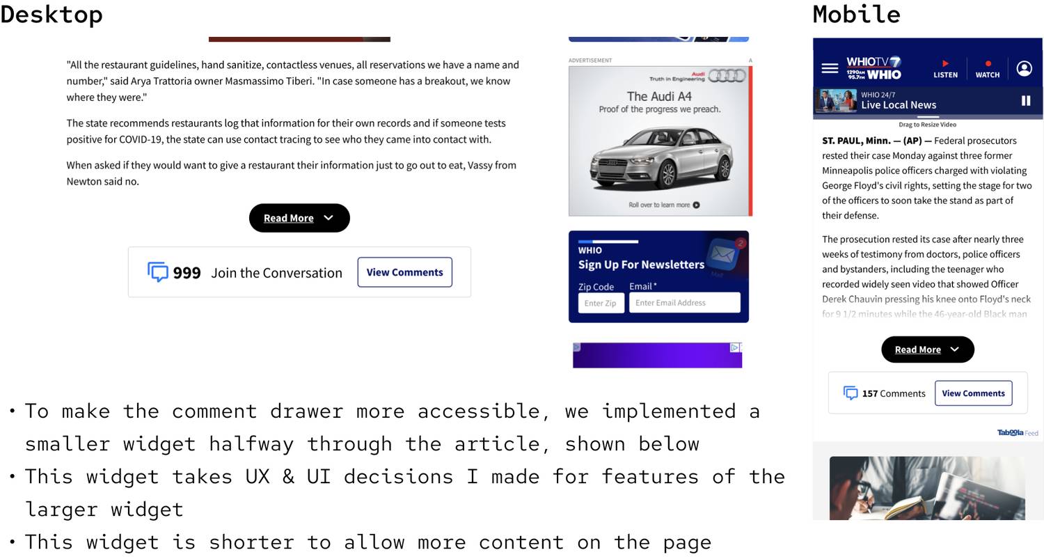
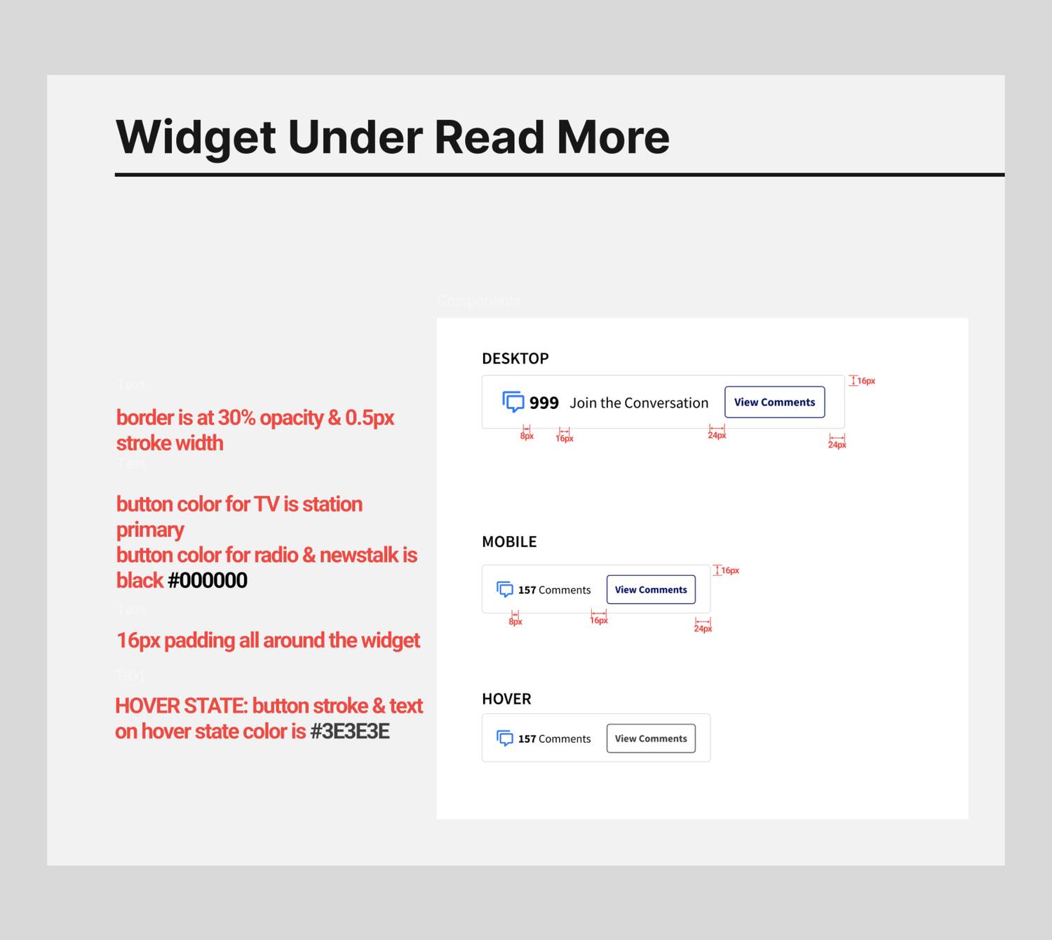
Secondary Comment Widget
Comment Drawer & Community Guidelines
Introductory Pop-up

FINAL DESIGN & DOCUMENTATION
DOCUMENTATION
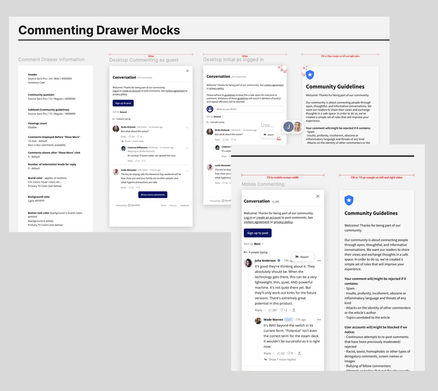
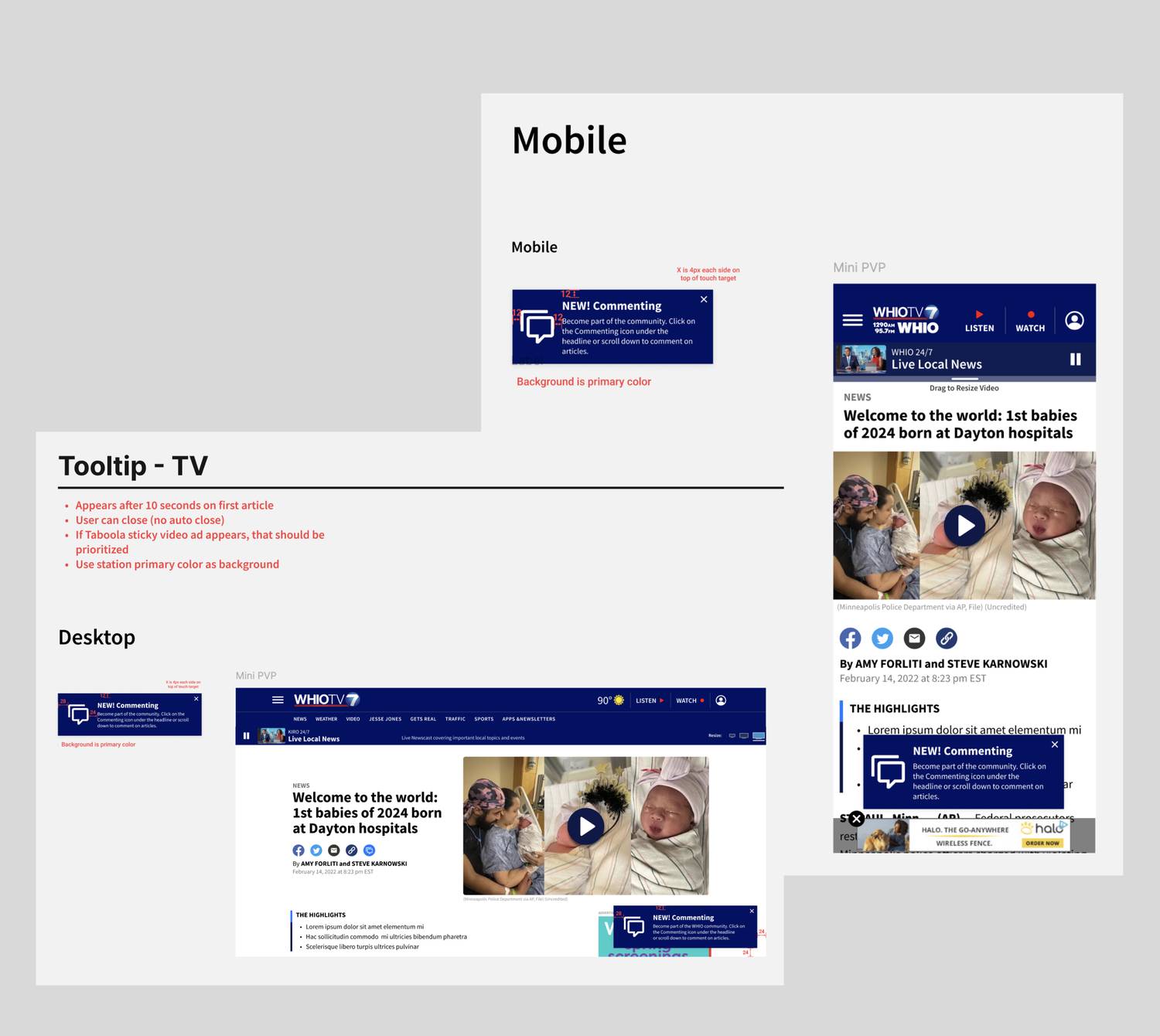
AFTERMATH: ANALYSIS
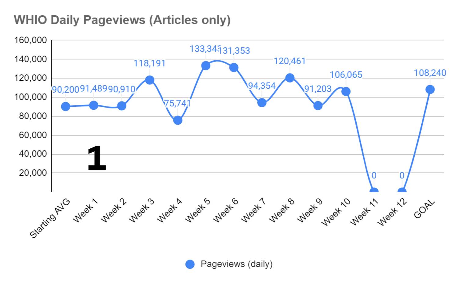
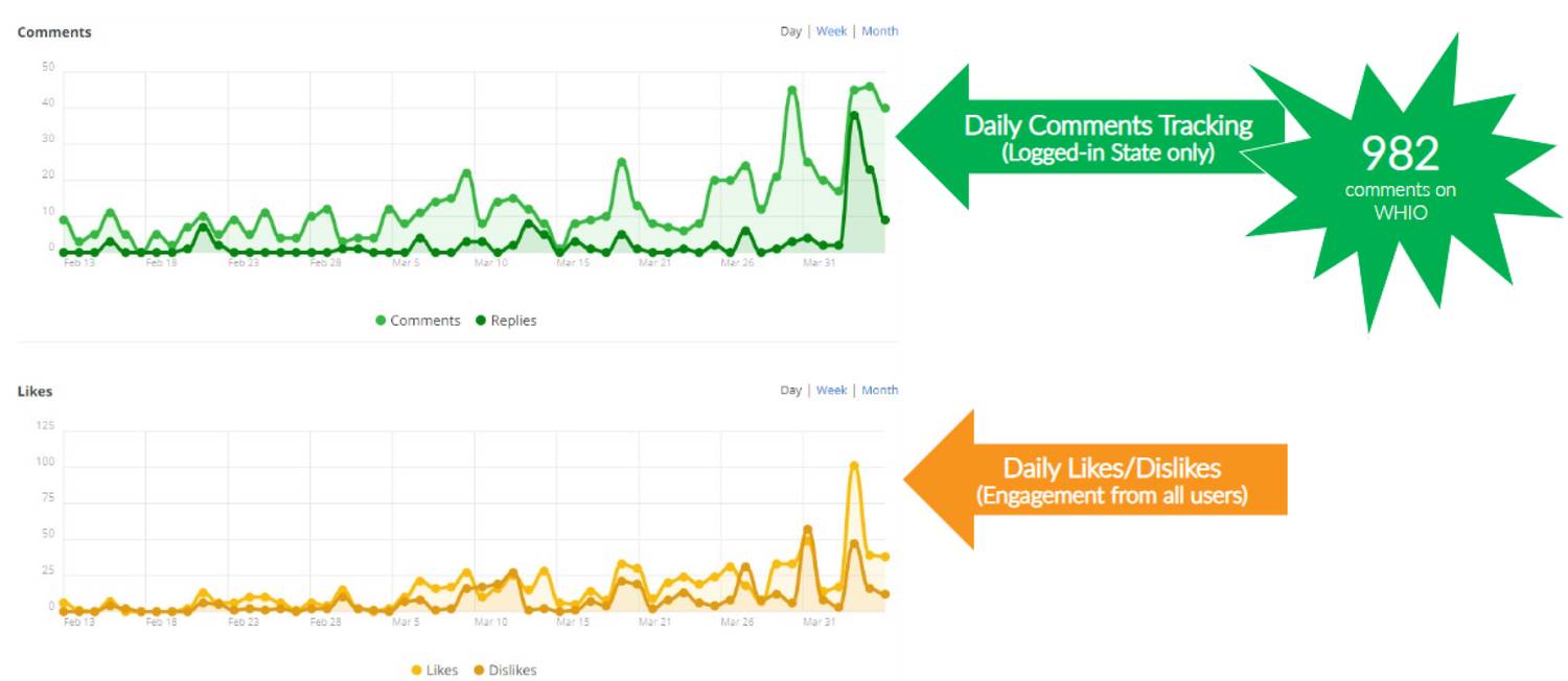
- 12% increase in article pageviews 1
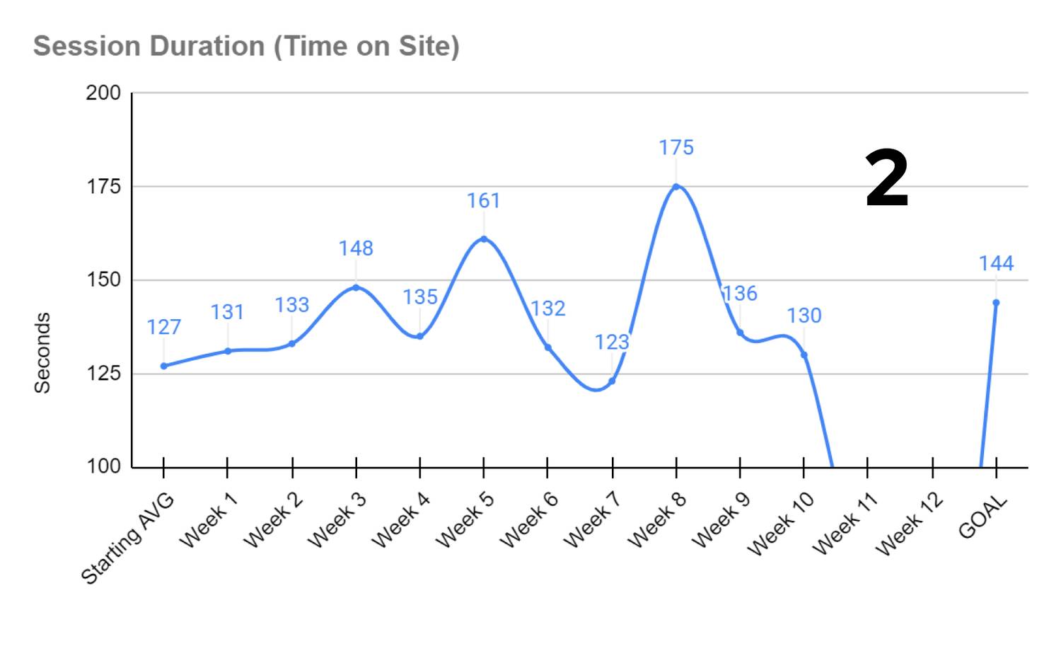
- 10% increase in time on site 2
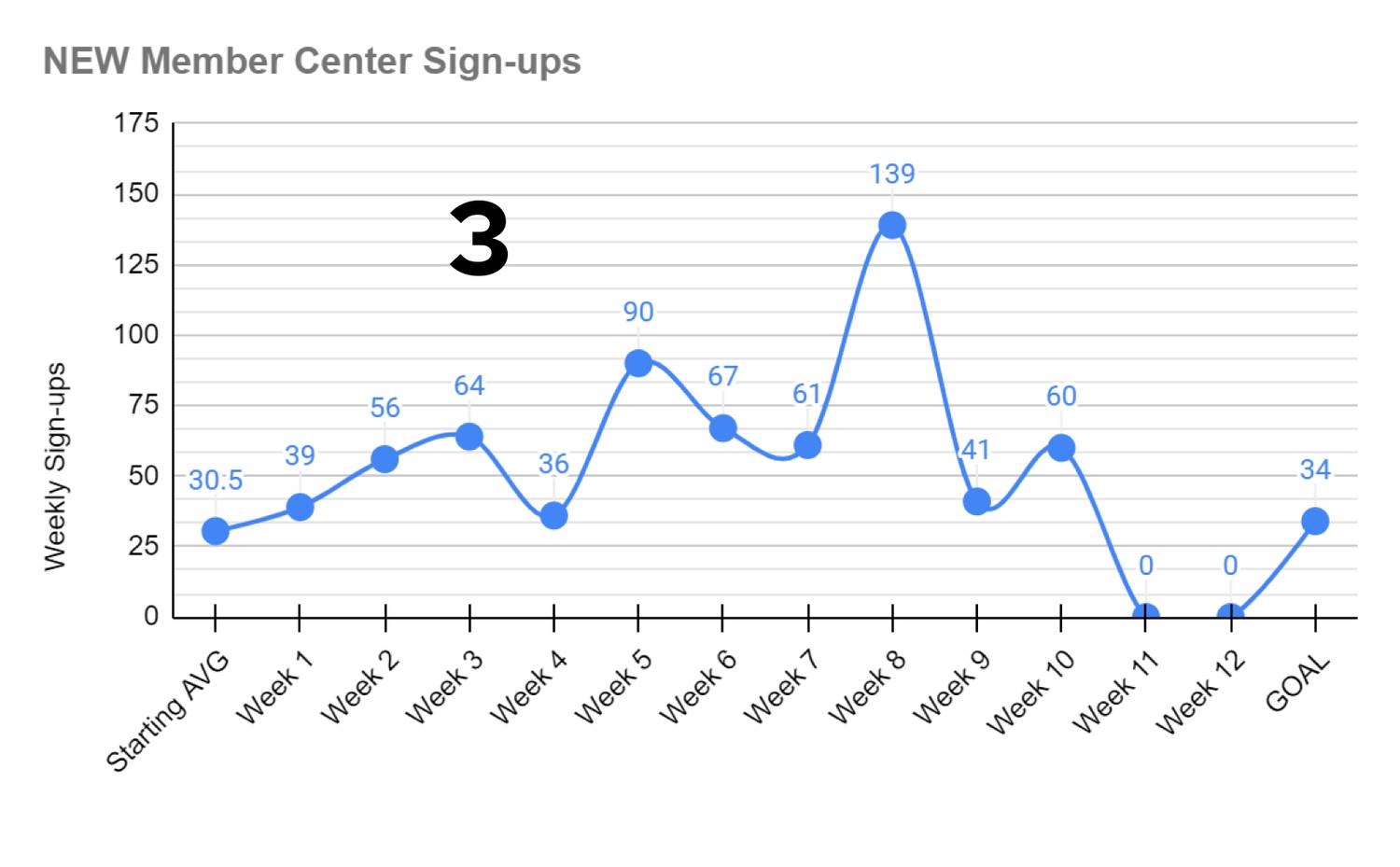
- 106% increase in site account sign ups (an account is needed to comment) 3
FINAL THOUGHTS
My team's workflow for this project, as well as many other projects I've worked on, had gone through back-and-forths, even after launch. Many times, I'd flesh out a design, only to find out that a lack of resources prevents it from being built. Despite this, we found workarounds and our proof-of-concept and full launches proved that the feature was indeed useful and advantageous.
The commenting feature can be found on our stations' website article/story pages. Check it out on any of the articles for WHIO.
